EleMed: Medication Reminder App
A collaborative app design project for a medication adherence tool, using context cues and habit stacking to improve reminders through research-driven UX design.
Project Objective
For this project, our team worked with Dr. Lisa Gualtieri to design an effective medication reminder device application and user interface. Dr. Gualtieri hypothesizes through her research that most existing medication reminder apps use time-based notifications, and are not very effective. Her vision was to instead create a medication reminder system that could be incorporated into a user’s personal morning routine, and uses contextual cues to send reminders.
The system has three components:
A sensor attached to any step within the user’s morning routine that detects when they perform an action for this step.
A sensor that detects whether or not the user has taken their medication.
A digital interface that sends reminders to the user only if they have performed the step in their routine but have not taken their medication.
For example, if the user brushes their teeth every morning, the device can be attached to their toothbrush. If they pick up their toothbrush but they have not yet taken their medication, the digital interface will send them a reminder.
User Personas & Journey Maps
We explored three potential user groups:
Young adults in university between 18-30 years-old
Elderly individuals between 65-85 years-old
Loved-ones of the medication users who support them in adhering
The following User Persona and User Journey deliverables provide a detailed perspective on these users’ lives.
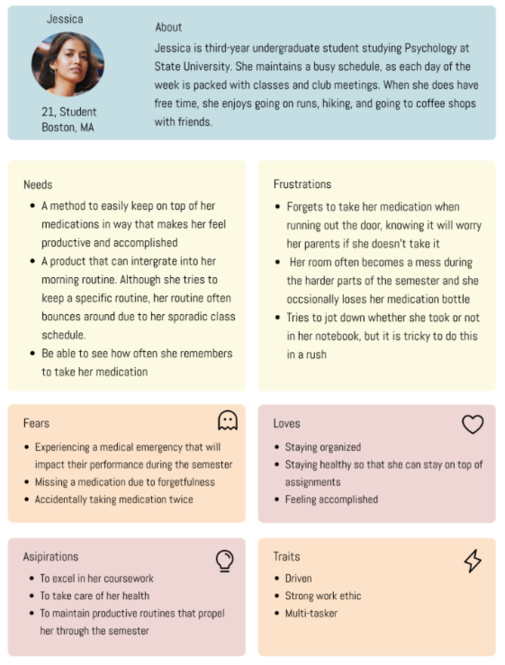
User Persona #1
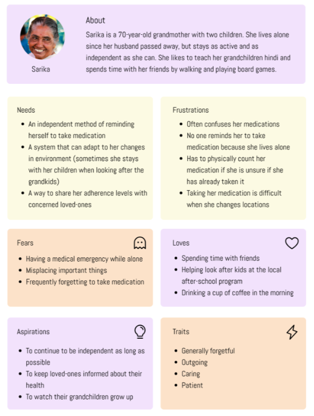
User Persona #2
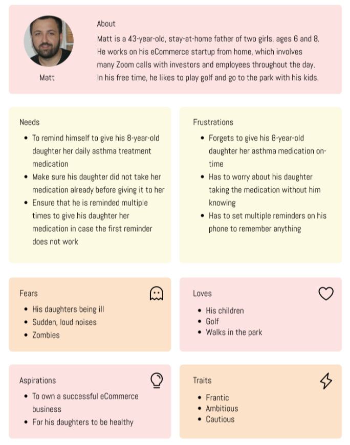
User Persona #3
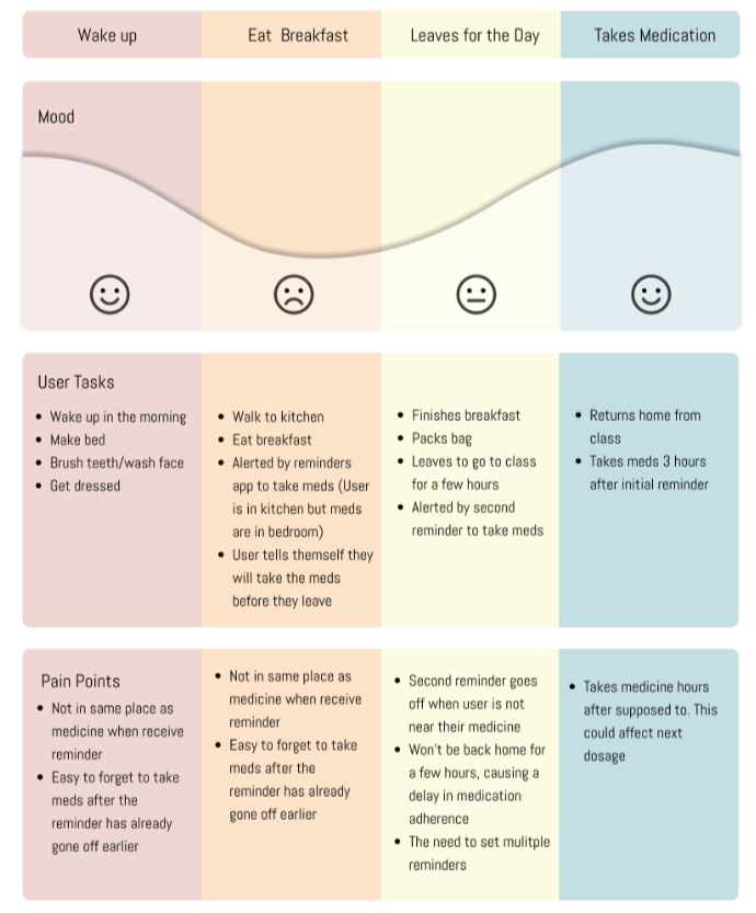
Journey Map #1
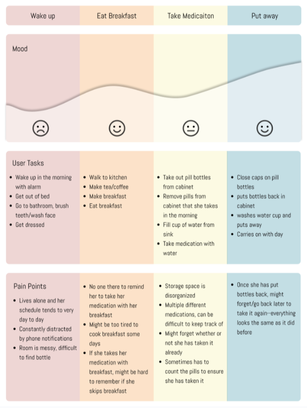
Journey Map #2
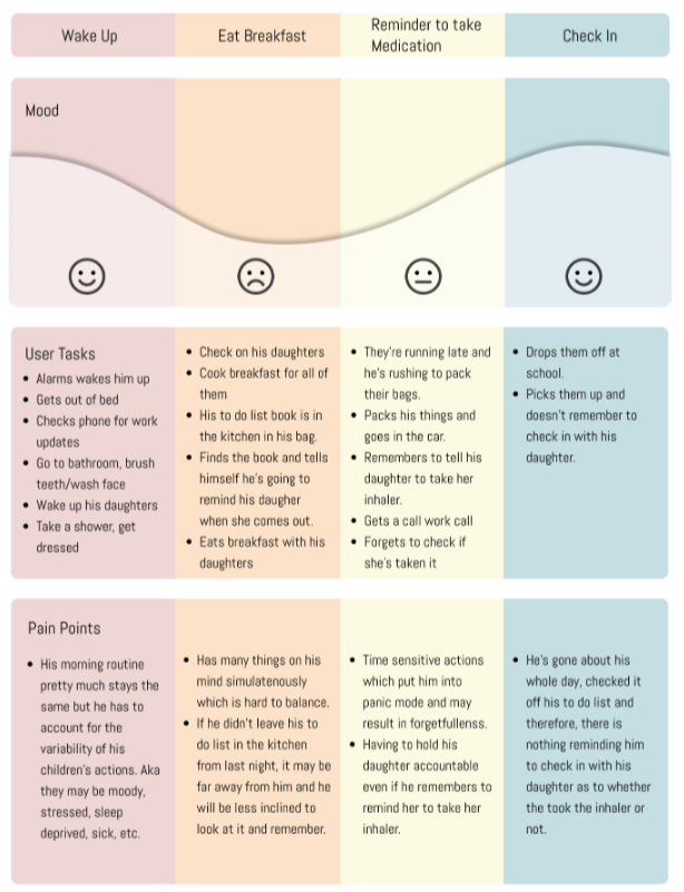
Journey Map #3
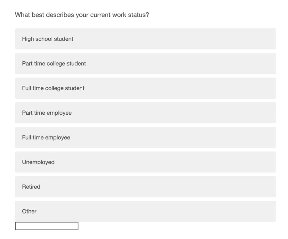
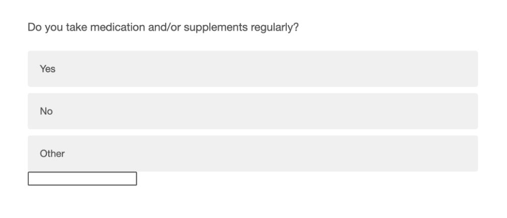
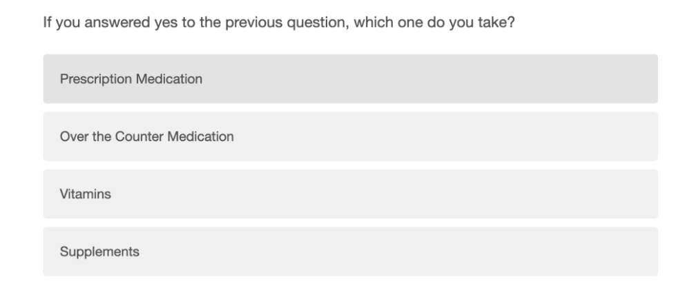
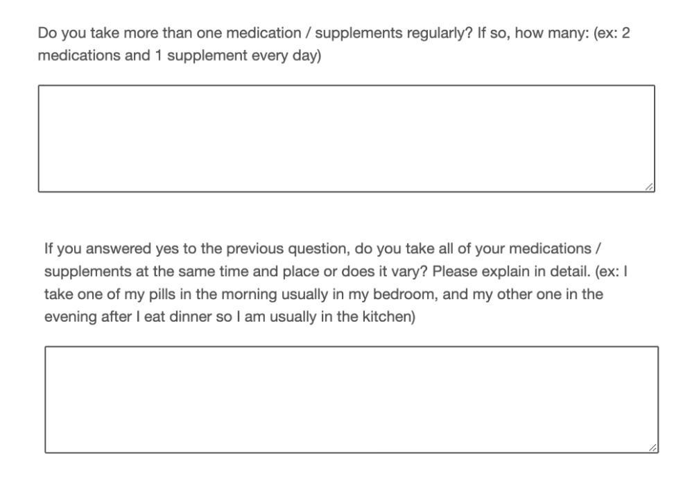
Questionnaire
Our questionnaire was used to gather preliminary data regarding individuals routines in taking their medication. The data we collected helped us create a mobile platform for the medication adherence mobile app.
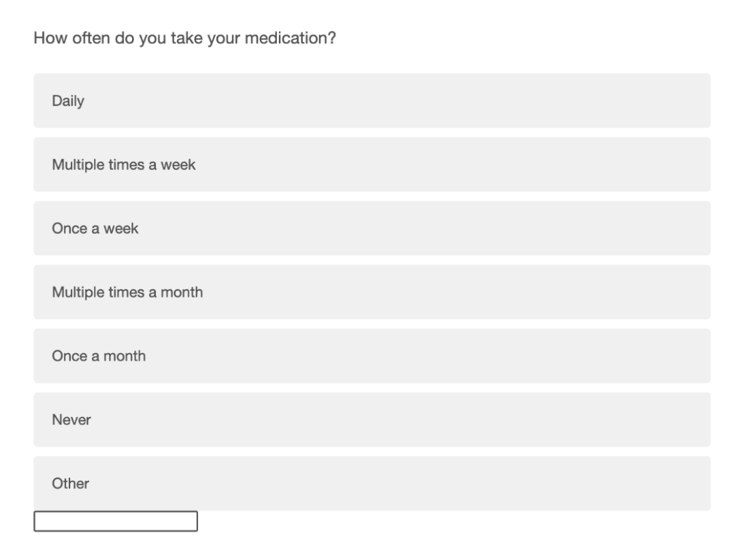
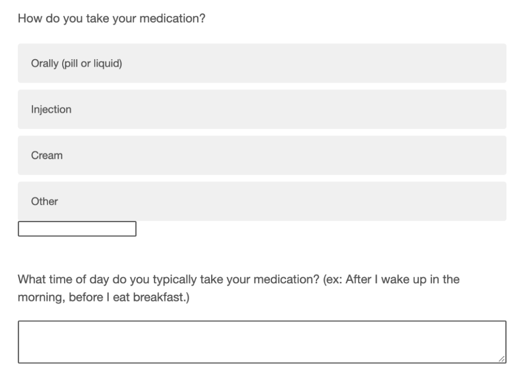
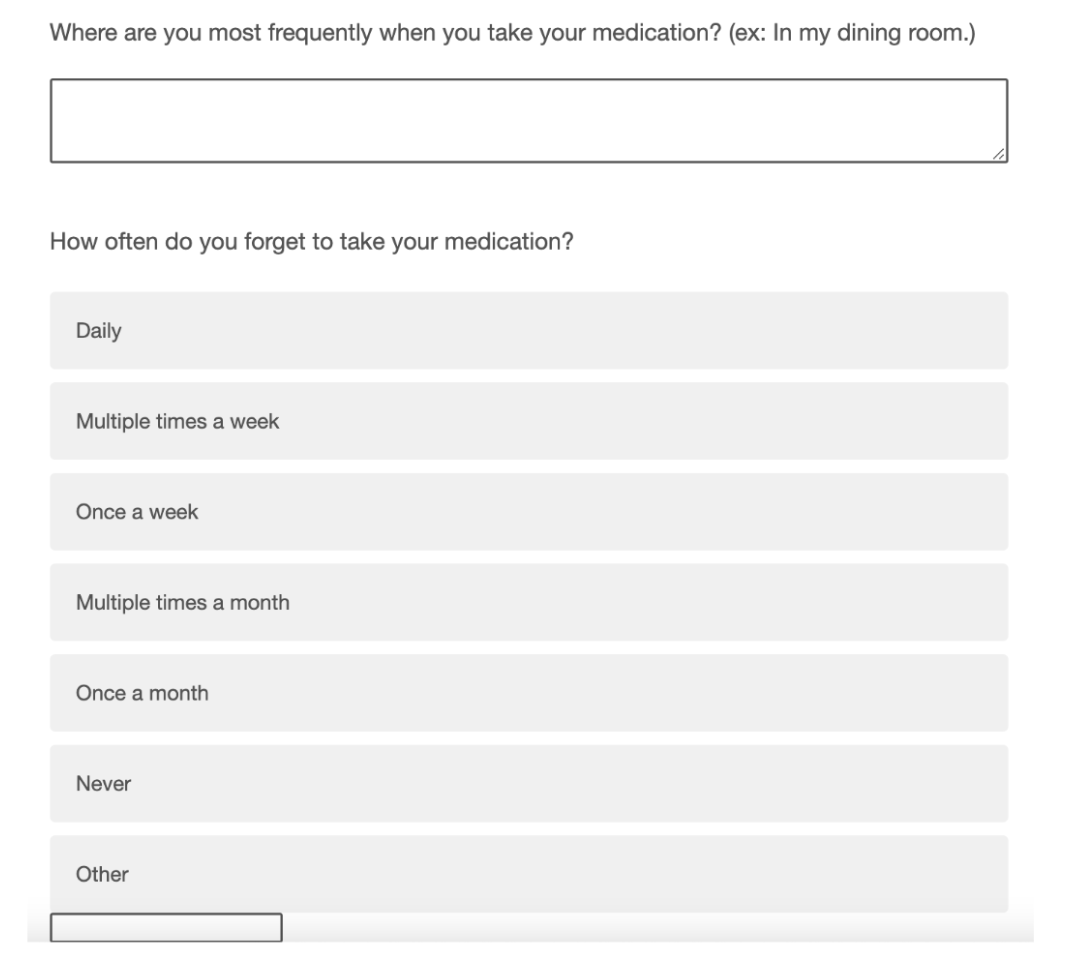
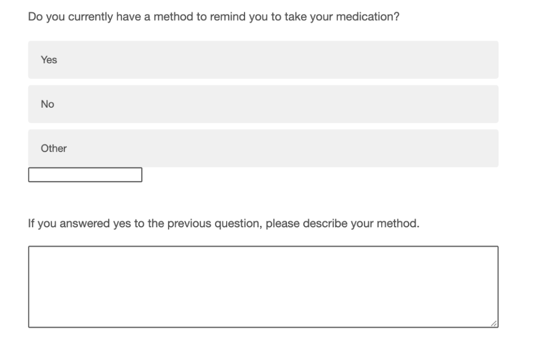
Based on the questionnaire below, here are the results and trends we felt were most important to address:
The majority of respondents take 1 medication and a supplement or a second medication
84% take their medication orally
84% take their medication daily
100% take medication at home
All respondents stated they take their medication either in bedroom or kitchen
67% of respondents said they sometimes forget to take their medication
The majority of people who have a reminder platform use an alarm or the reminders app on their phone
Diary Log
We employed the use of a diary study in order to gather contextual information regarding the morning routines of people who take medication. We recruited four participants (three females, one male) who take daily medication or supplements. Each participant was instructed to record their every action, from the moment they woke up to when they subjectively considered their morning routine to end. We asked them to record their behaviors on a provided diary sheet during their routines or within thirty minutes following the end of their routine.
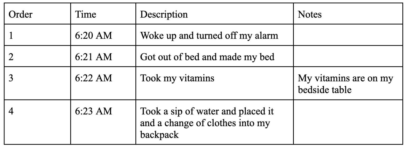
Example Entry
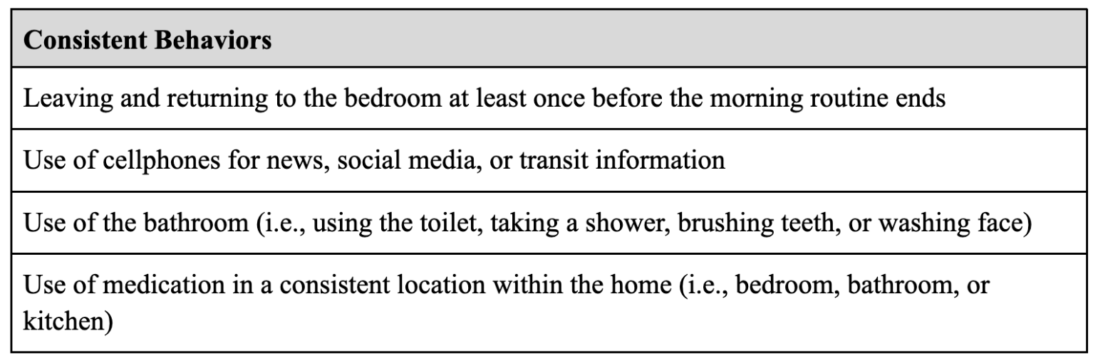
Consistent Behaviors
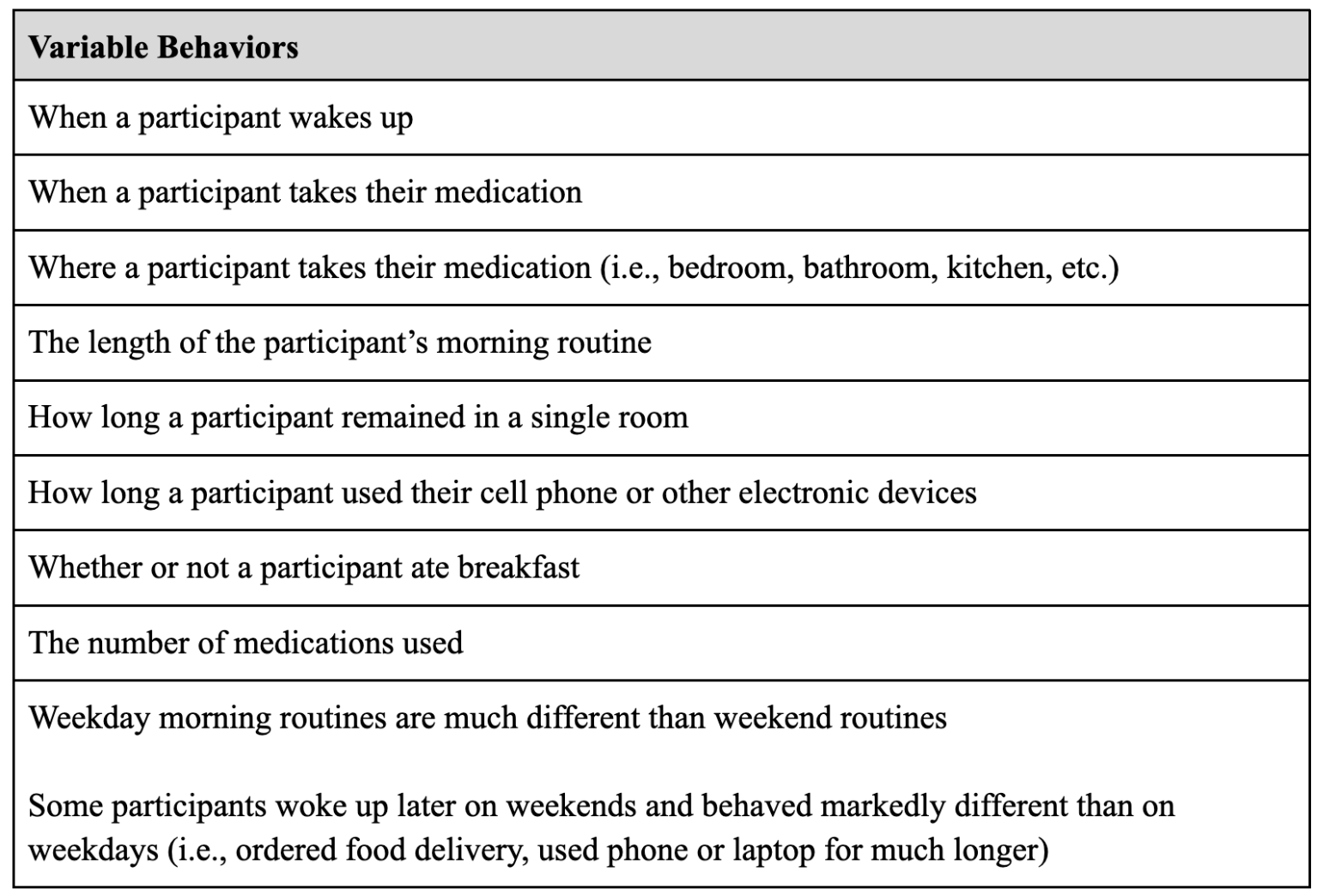
Variable Behaviors
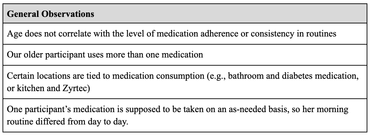
General Observations
User Needs & Risk Analysis
In order to learn which features and interactions should be prioritized in the design of the EleMed app, a risk analysis was conducted. The analysis was split into three categories: potential application errors, potential user errors, and potential user errors when using an application.
From this risk analysis, 3 key requirements were identified to be high priorities to ensure a lower probability of the user experiencing potentially hazardous situations:
The app should be adaptive to the user’s morning routine and account for any changes
The app should have separate data for different users
The app should keep track of and record all medication-patient interactions
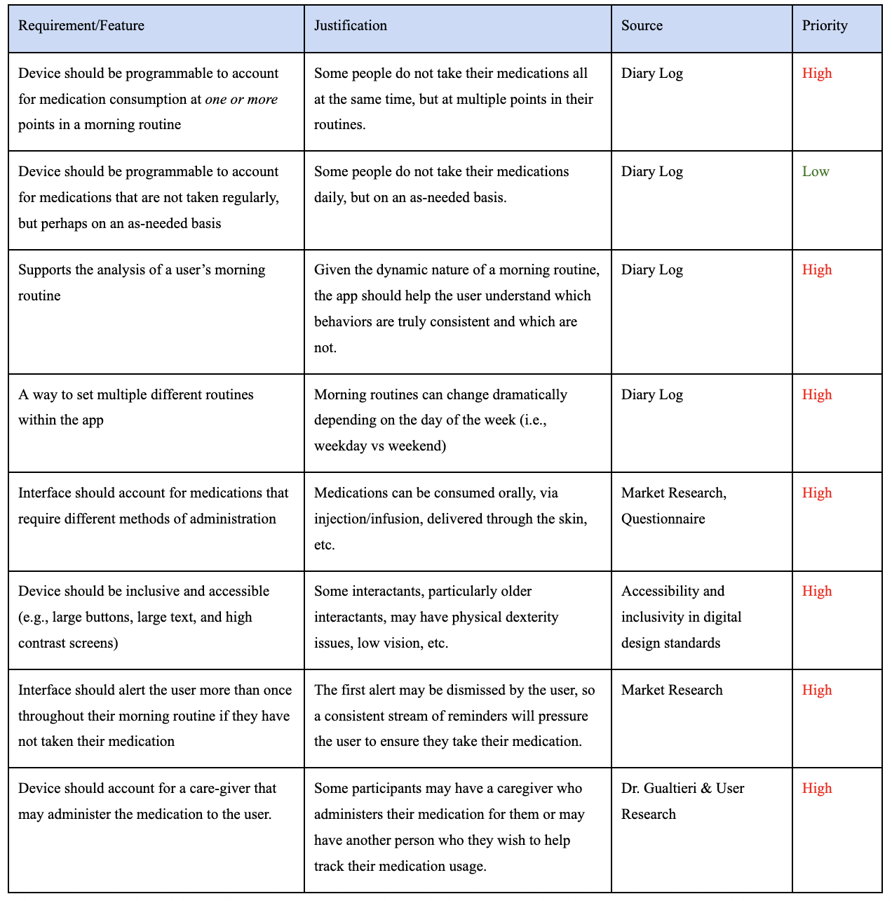
User Needs & Requirements
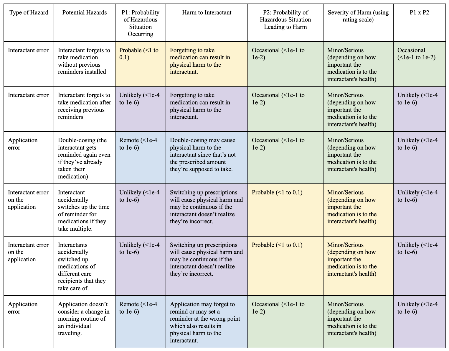
Risk Analysis
User Flows & Task Analysis
A simple first step to solidify the high-level user experience was to create a User Flow diagram outlining when a user would interact with the app during their morning routine. The goal of this flow was to provide a consistent understanding of when a user would receive a notification from the app about missing a medication.
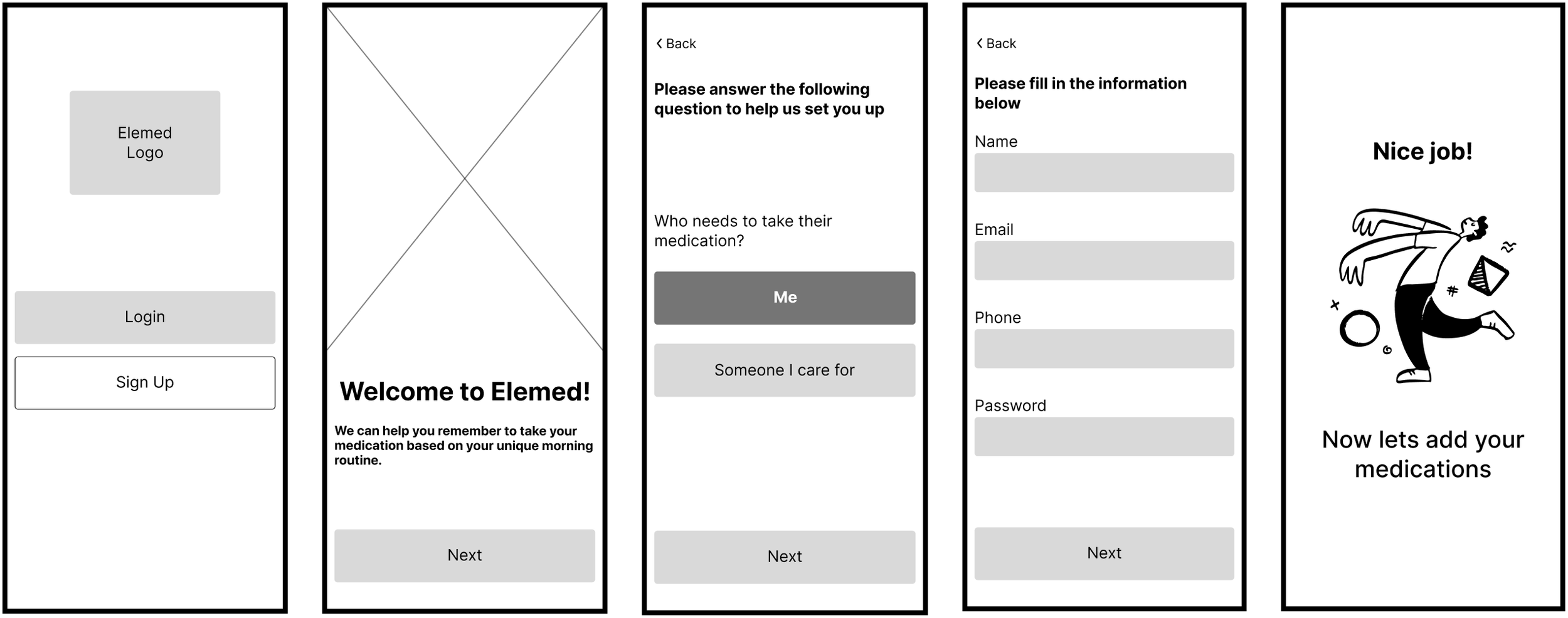
Next, we created a user flow for the onboarding process of a new user. This was an essential flow to document because onboarding would involve inputting a variety of information and learning about the product as a whole. The goal for this user flow was thus to map out the most concise and informative series of steps for a new user to complete.
In conjunction with the risk analysis, we conducted two major task analyses of expected major features of the app. The two features were adding medication information and setting up a contextual reminder.
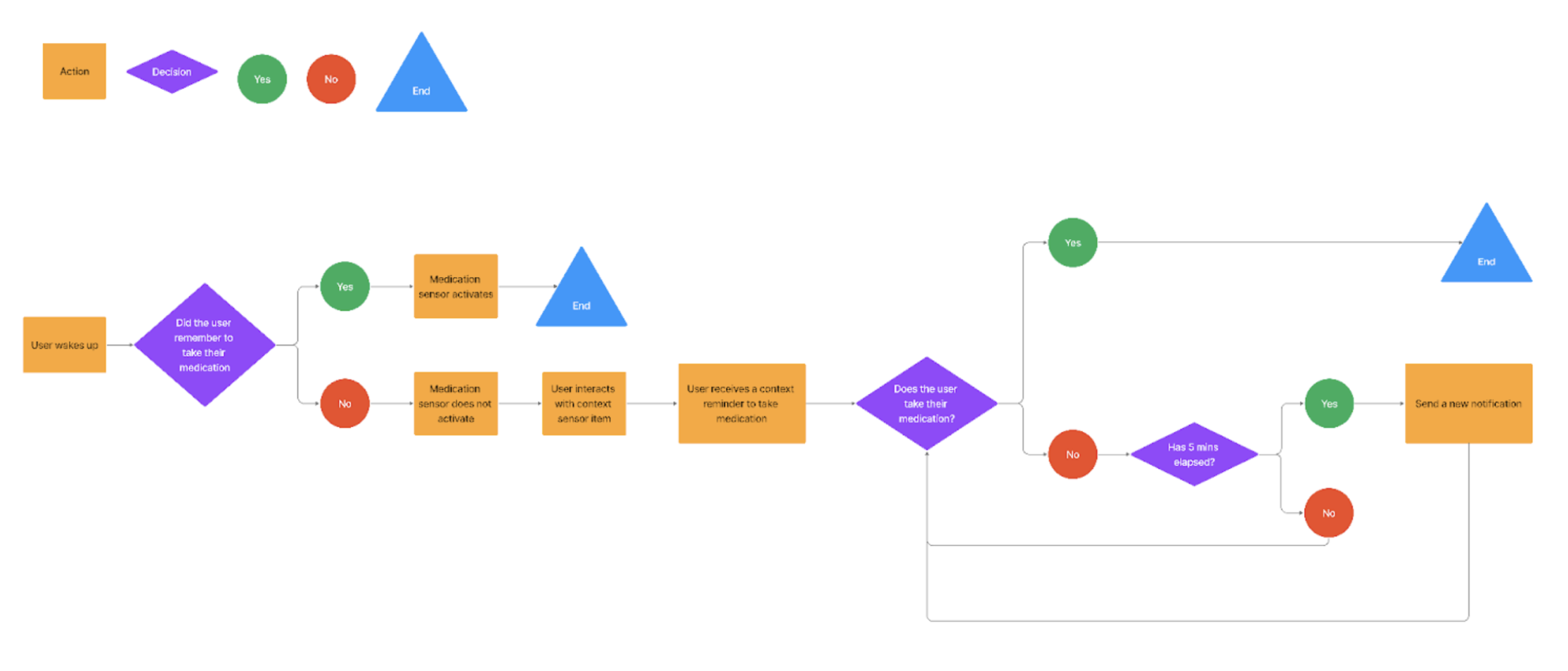
User Flow: High Level
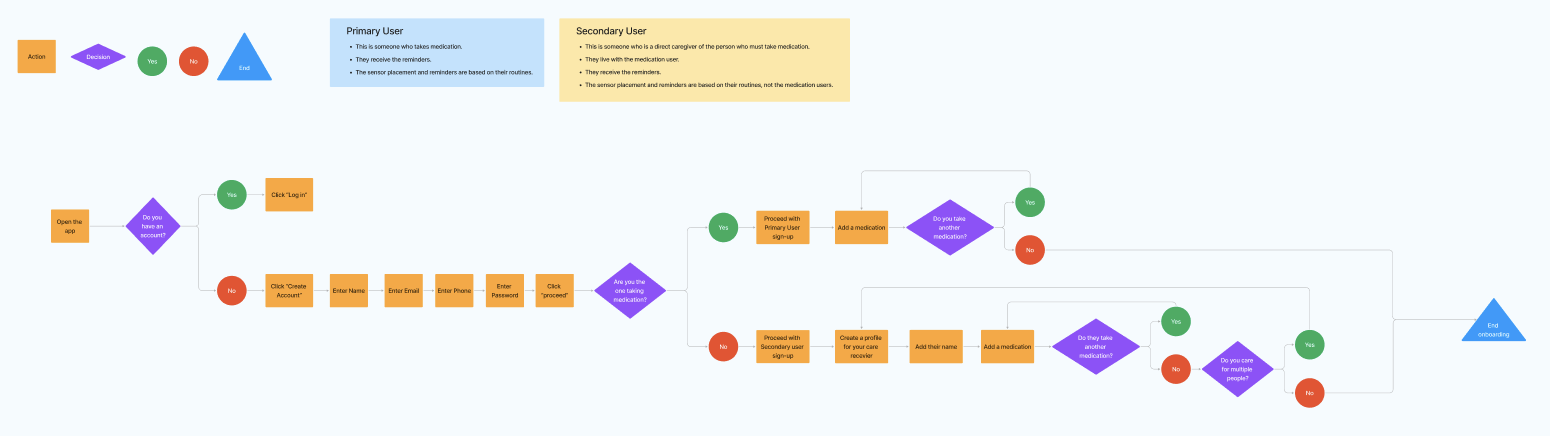
User Flow: Onboarding
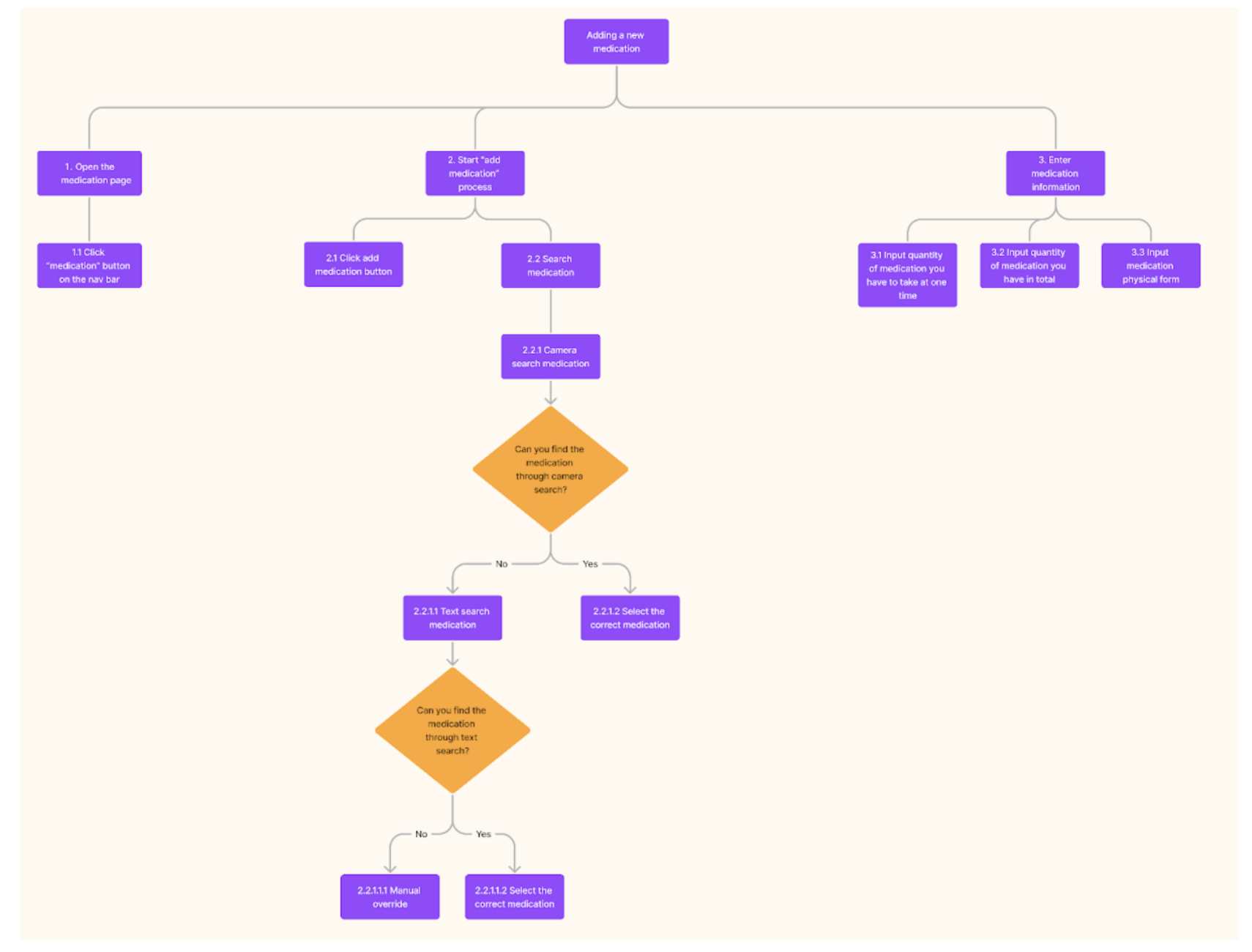
Task Analysis: Adding New Medication
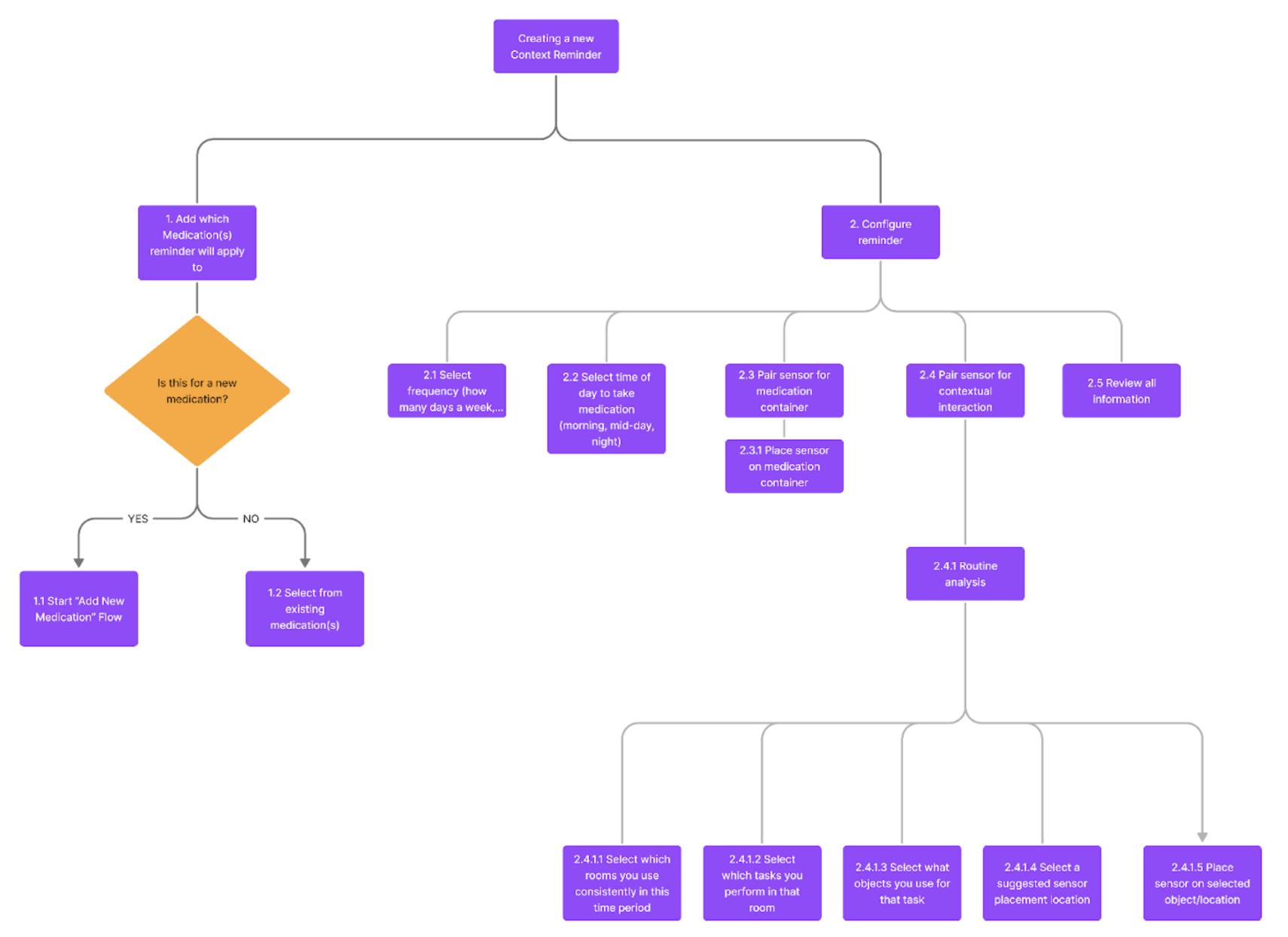
Task Analysis: Setting New Context Reminder
Low Fidelity Wireframes
Based on the feature list and task analyses, a matching set of initial wireframes was produced. These wireframes helped to expose flaws in the task analyses/designs of key user flows during usability testing, informing the design of the high-fidelity prototypes that followed.
Usability Testing & Application
Once we were able to build the wireframes for the EleMed application, we went on to usability testing to see how users felt about the current interface. The usability testing took the form of remote and in-person interviews with 4 individuals. Prior to walking through the onboarding screens, each participant would receive a verbal prompt as follows:
Every Monday and Thursday, you must take 10mg of Allegra to help with your daily allergies. You usually take the medication in the kitchen after you drink your coffee in the morning. However, you forget to take your medications occasionally and have found EleMed to help you solve this issue! Walk through this interface to set up a reminder to help you remember to take your Allegra. As you walk through this interface, we’ll ask you follow-up questions regarding parts of the interface. Feel free to tell us when a specific part of the interface may be confusing to you. Let’s get started.
Interviewers were instructed to ask follow-up questions whilst the participant was walking through the onboarding workflow and to focus on specific areas where they were confused or specific areas of the interface they enjoyed. Some of the key takeaways from these interviews were:
A user thought the concept of EleMed was confusing and needed a verbal explanation of how the sensor’s worked, why there were two sensors, and how they were supposed to connect prior to finishing the onboarding process
Users thought instructions to adjust the sensor were confusing
Users thought some buttons were unnecessary to include on the interface and some were missing
Users identified issues with the drop down interaction of the prototype
Users didn’t enjoy it when a screen had no interaction involved and nowhere to click, and were confused on what to do and not patient enough to wait for the screen to change
Users didn’t understand labels of some buttons / features
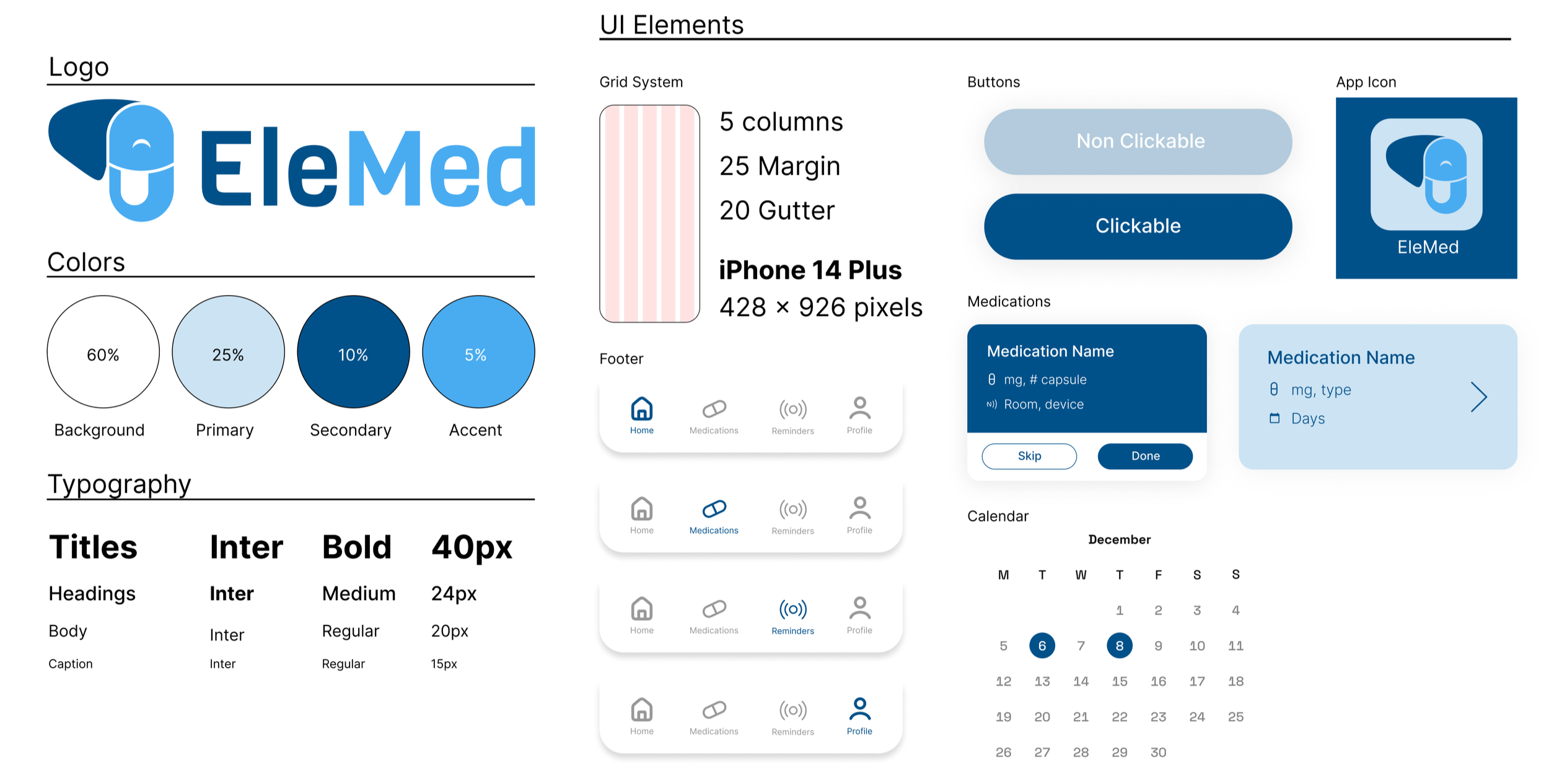
Branding
To bring the wireframes to life via high-fidelity prototypes, some preliminary branding guidance and a design system was necessary. Using the brand name as inspiration, we tried to incorporate the elephant and pill/medication capsule into a recognizable graphic mark. Paired with a Tufts-inspired color palette and some key adjectives like “remember, reminder, and routine” we believe that these branding elements accurately convey EleMed’s value proposition and will serve as the basis for further brand development and recognizability.
We refined these branding ideas, landing on a design system for the high-fidelity prototypes. Following the 60:30:10 rule (60% white, 30% light blue, and 10% dark blue), we produced a color palette which is heavy on blue to reflect the dependability and reliability of the product. We also ran these colors through a contrast/accessibility checker to ensure that this palette met accessibility standards. Lastly, we applied the Inter typeface to the high-fidelity prototypes because it is an extremely legible font and it aligned with the current design system.
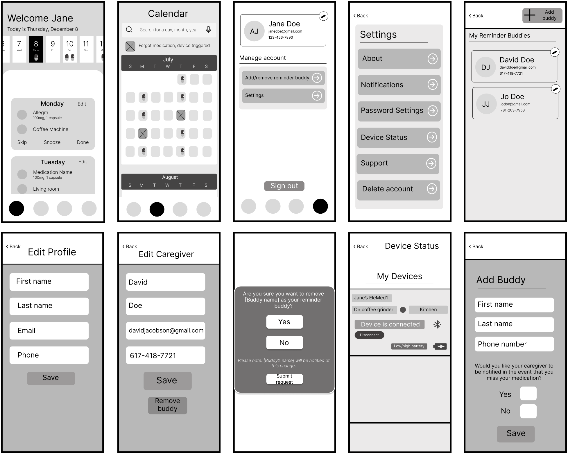
High Fidelity Screens
During the development process, we made several changes to the low fidelity wireframes in order to improve the user experience. One change we made was the addition of an introductory section right before onboarding. We included this section in response to user feedback indicating that some users were confused about the purpose of EleMed. This introductory section provided a clear explanation of the product and its benefits, which helped users understand the value of using our product.
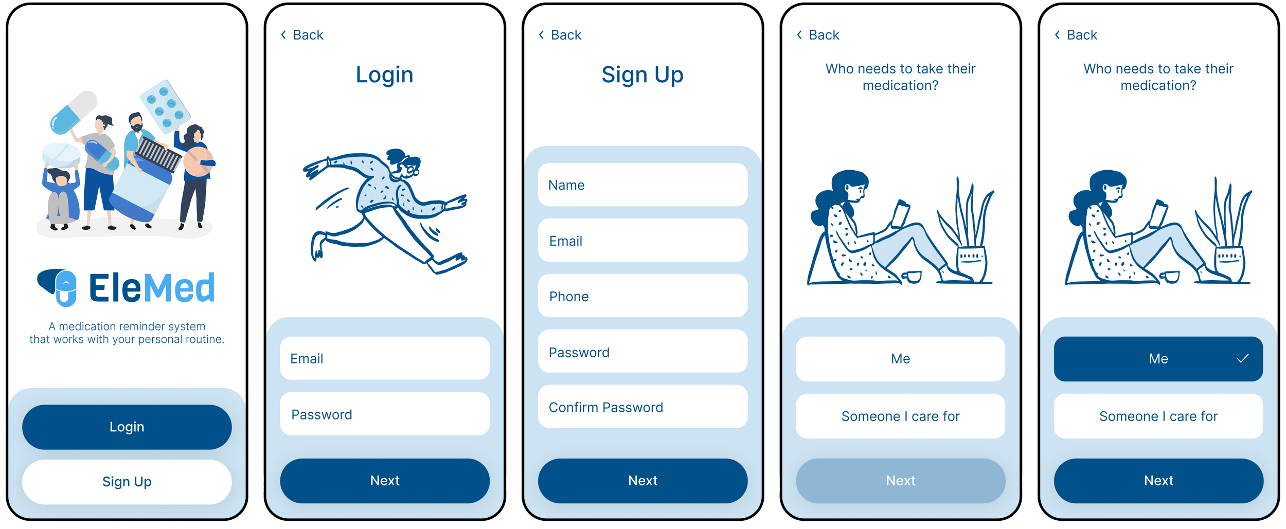
Login/Sign Up
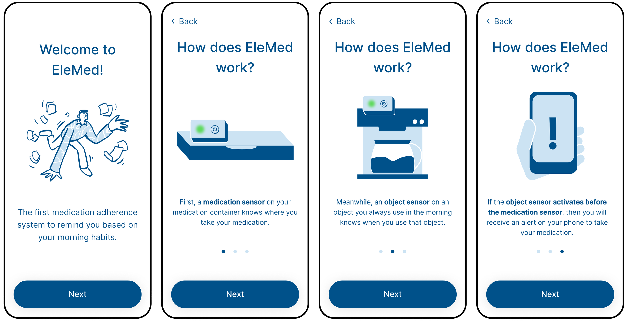
Feature Explanation
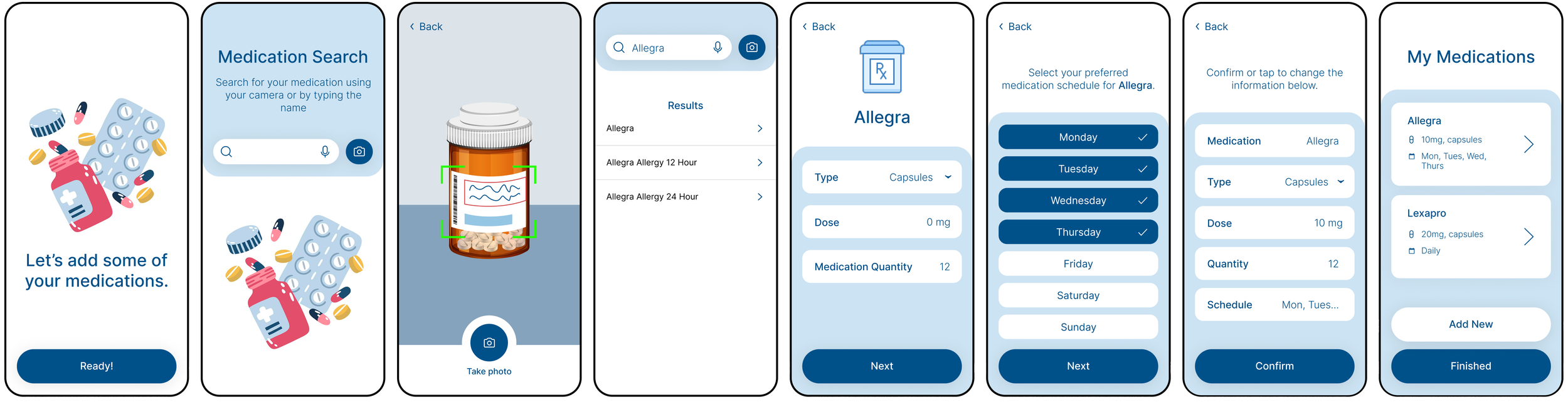
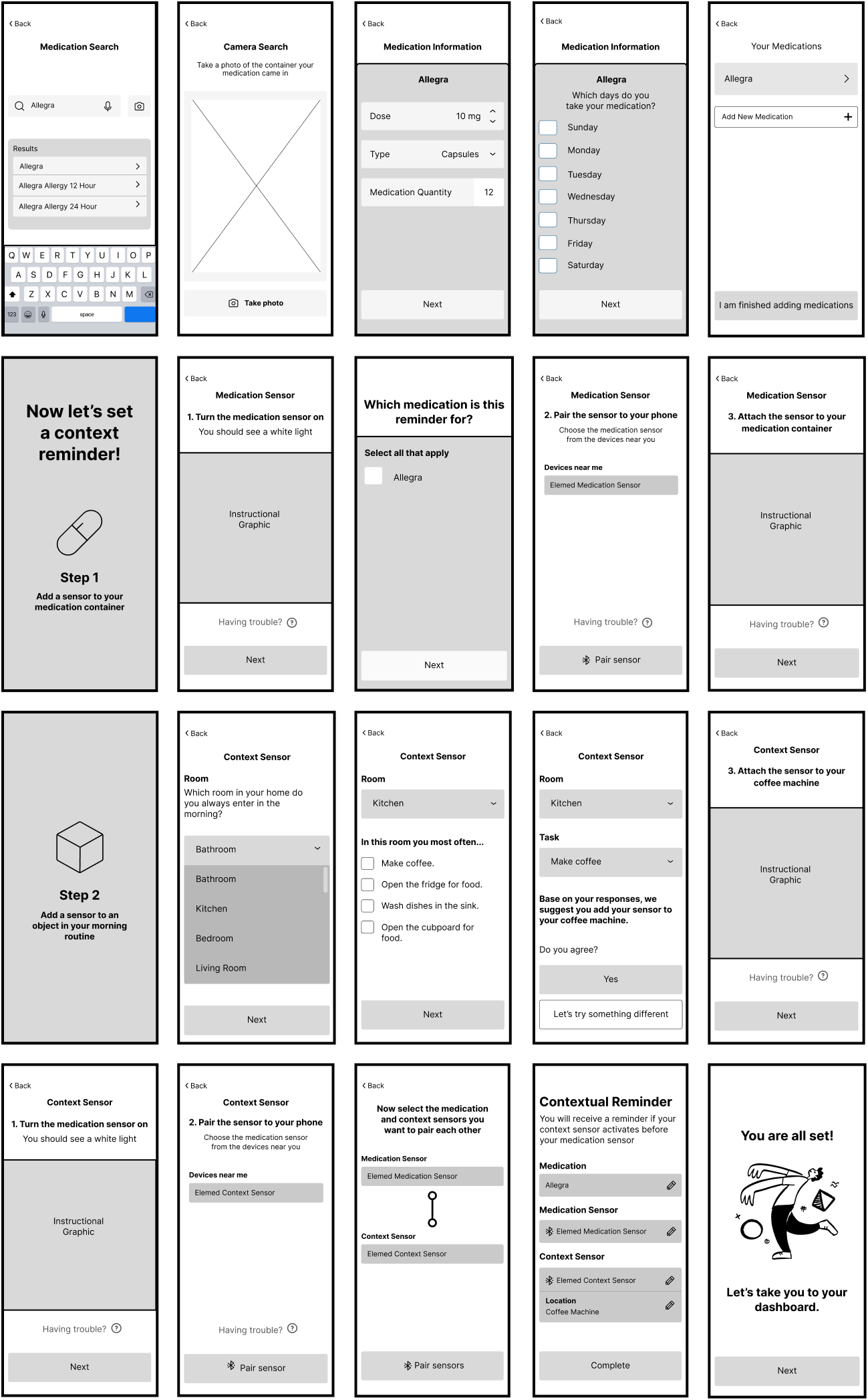
Add Medications
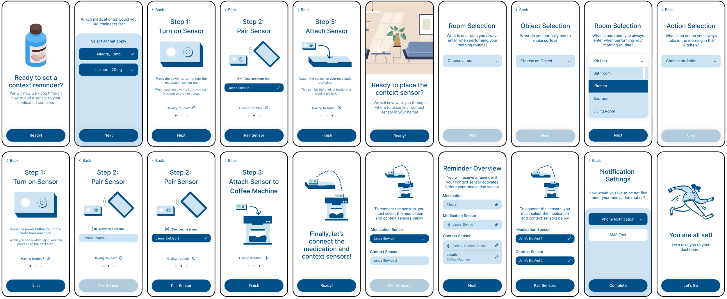
Set Context Reminders
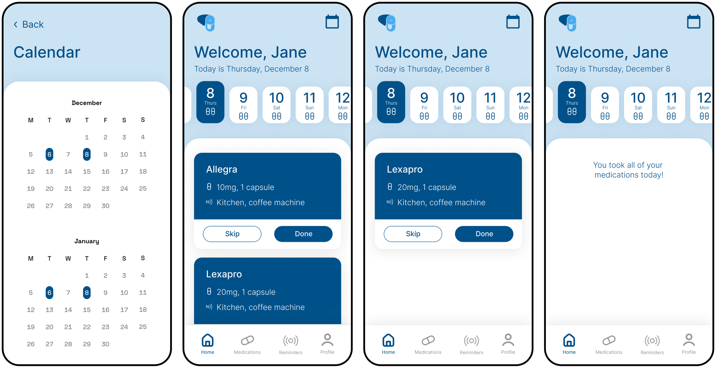
Calendar/Home
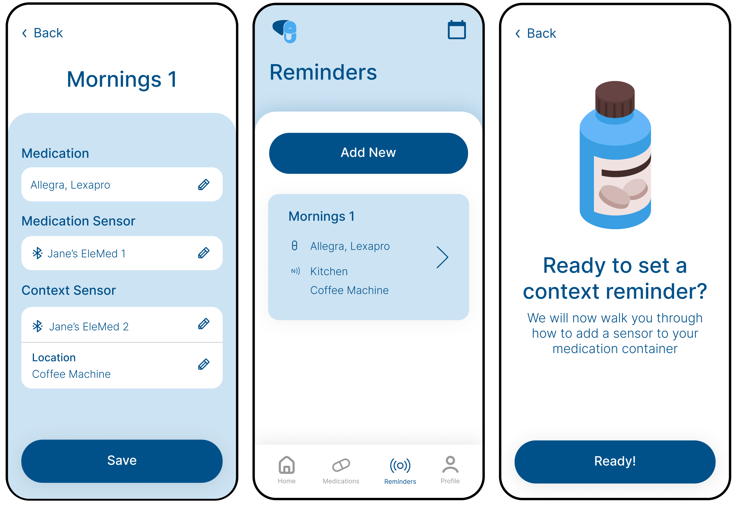
Reminders
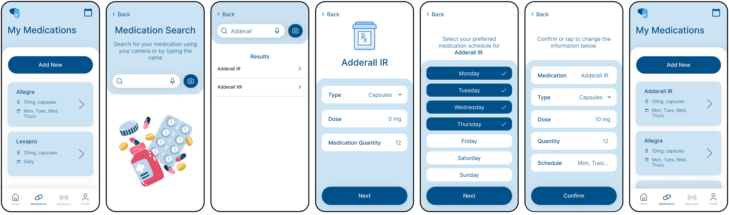
Medications
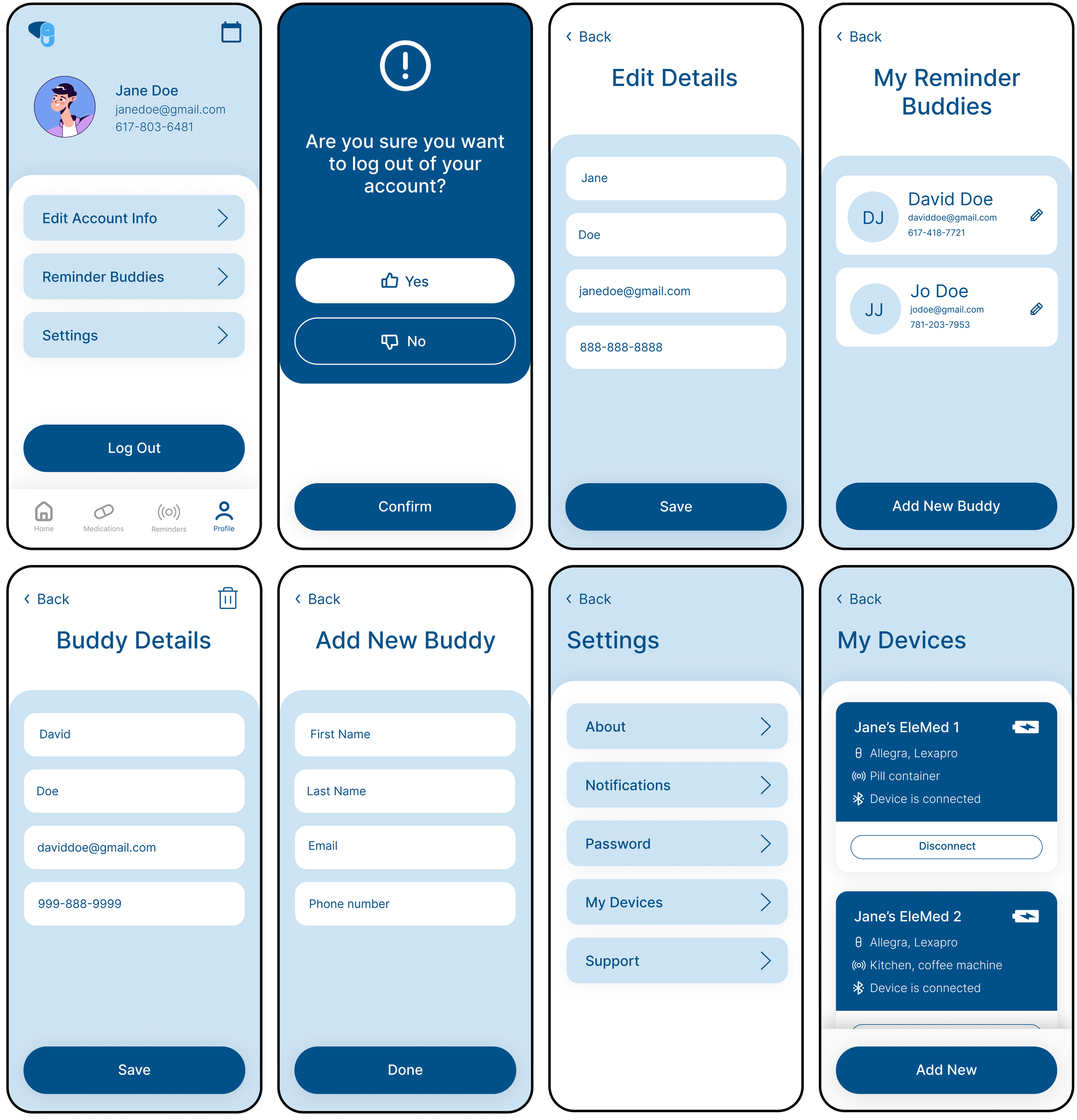
Profile/Settings