Qwerty Farm: A UX Study on Stardew Valley
A redesign of my Stardew Valley farm layout using a UX framework with graphic visualizations of my process and final product.
Stardew Valley’s gameplay is much like the design process. The game itself is laid out on a tile-based grid, and a core aspect is building a layout for your personal farm. The goal is to create a farm that is aesthetically pleasing but also functional and usable, much like user-centered design. In this case, the farm layout is the interface, and the player is the user. For this project, I was interested in studying this more deeply, and analyzing the the parallels between this game and design.
I revisited my old farm from a year ago, which is called “Qwerty Farm.” The very first time I had played Stardew Valley on my Nintendo Switch, I was able to get pretty far in the main storyline. Unfortunately, I lost my game card and so I started a new game on Steam. I was impatient, and tried to level up as fast as possible to reach where I was before. This caused Qwerty Farm’s layout to suffer; I had too many items and materials, but no clear layout or organization system, which made gameplay more difficult than necessary. After realizing this, I knew that I needed to redesign my farm, but I didn’t know where to start. It felt overwhelming. So, I decided to approach the redesign of my farm like how I was trained to approach a product redesign through a user-centered framework.
Persona & Teardown
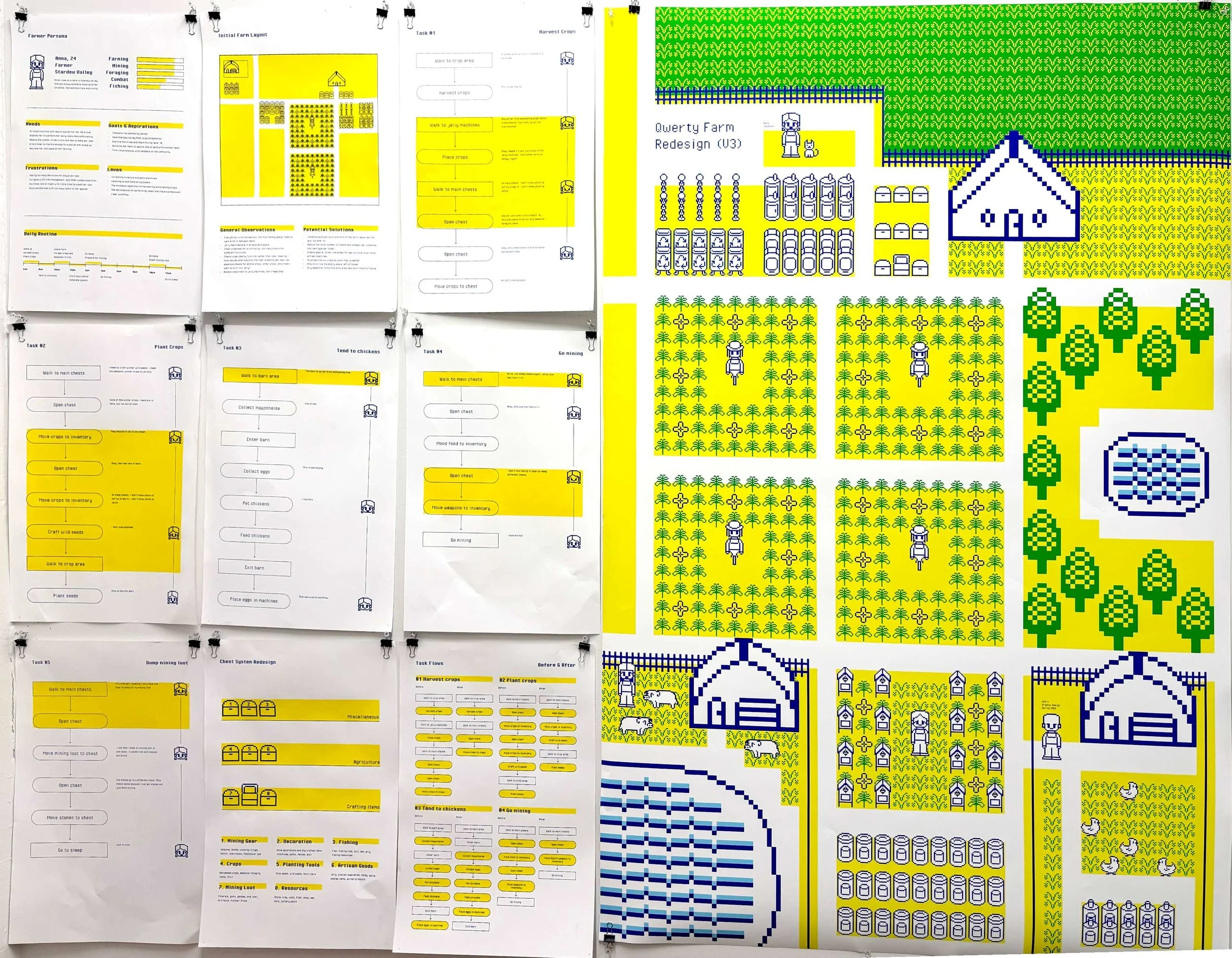
The first step to approaching a redesign is to look at what already exists and to understand the core user needs. What exactly is working, and what is not working? Where are the points of decision-making, and pain points that are frustrating to the user? What are the user’s core priorities? In this case, I was the core user, so I needed to design a farm specifically for my playing style. I hadn’t played this game for a while, so I decided to start by just playing through a couple of in-game days to get a feel for my personal playing style. The game is structured so that each real-world minute is an in-game hour. Each “day” involves tasks to complete on your farm, like attending to your crops or feeding your animals. I noted all of my daily tasks, my priorities while playing, and issues/pain points I noticed. I visualized my findings in the form of risographs prints, which are shown below.
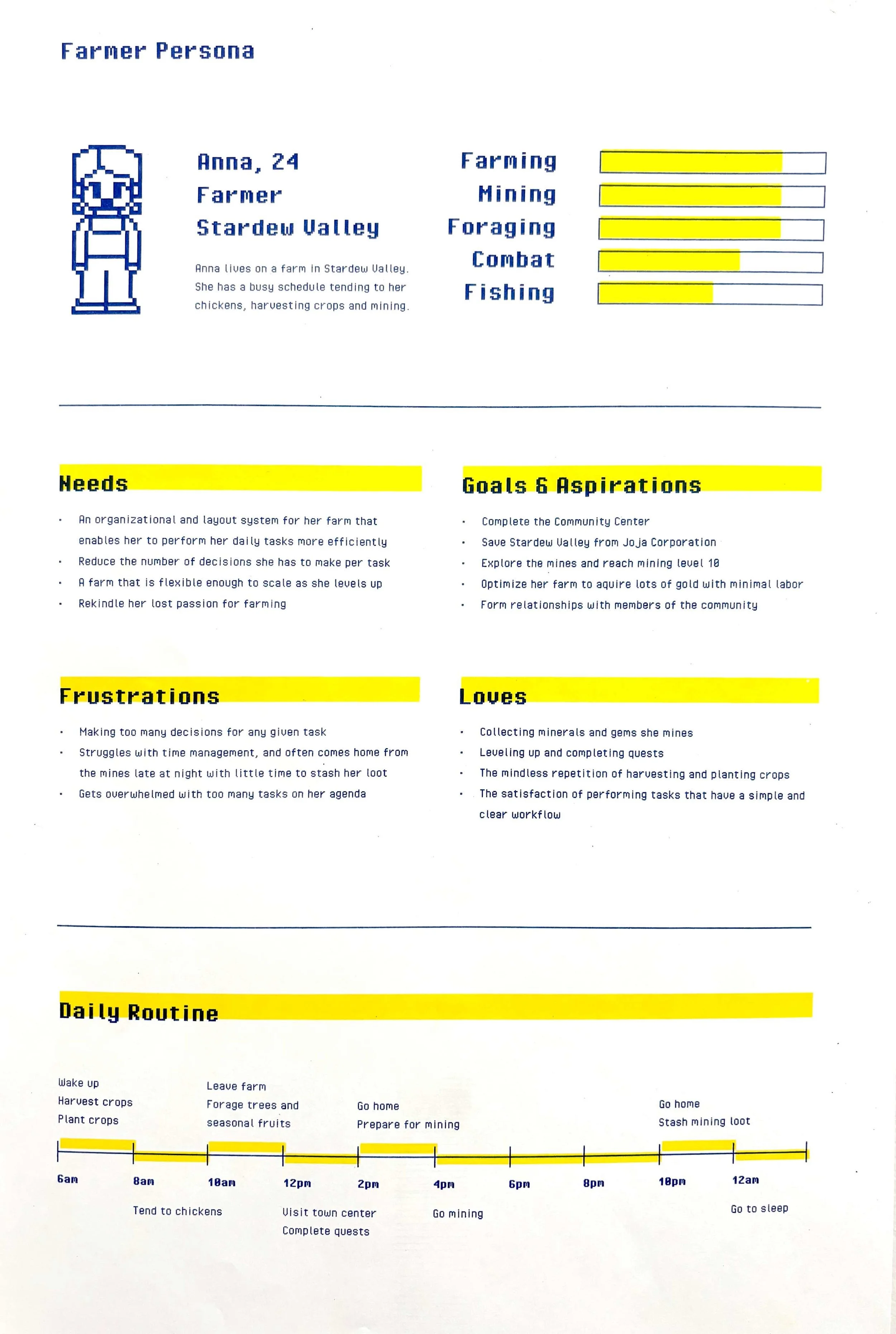
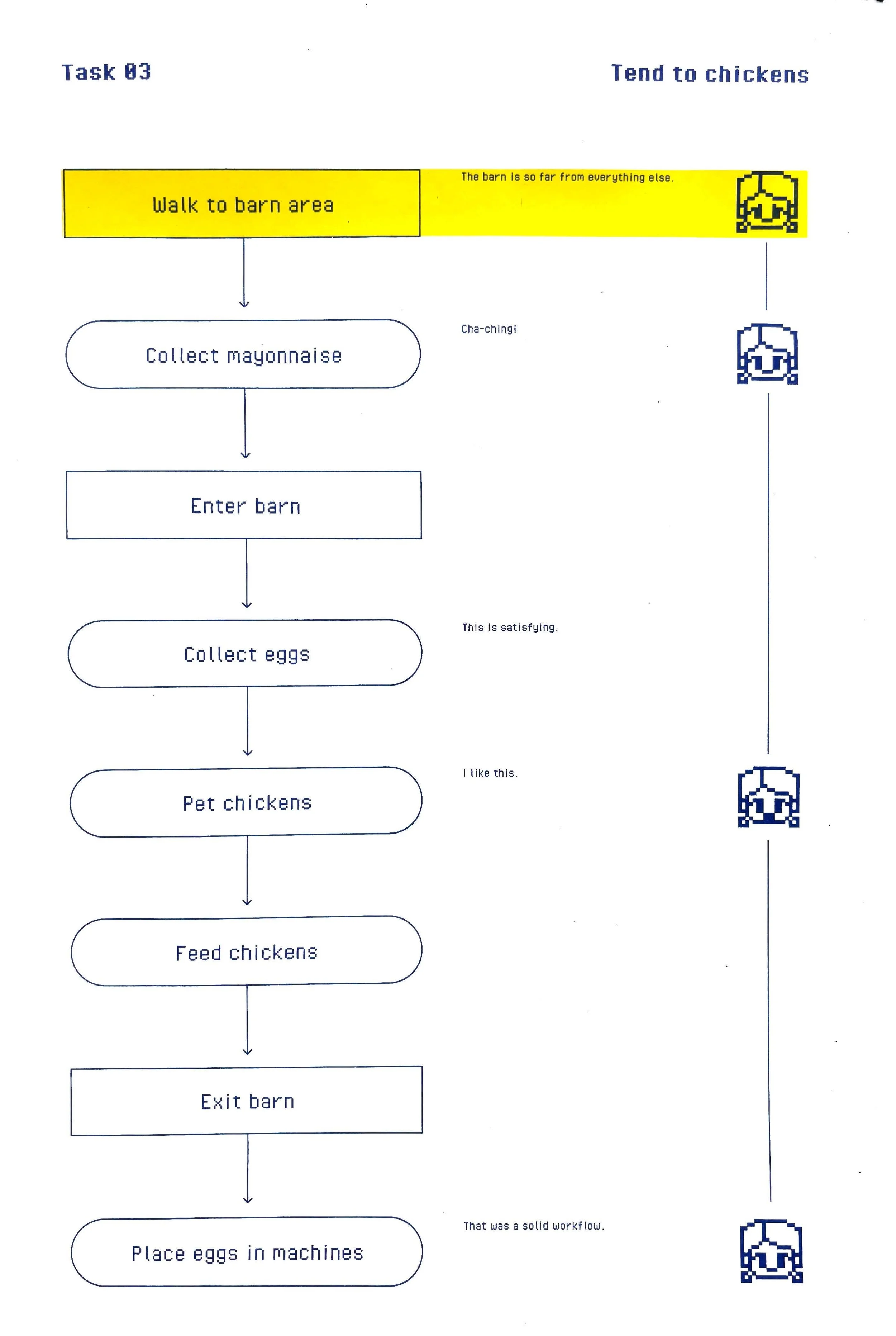
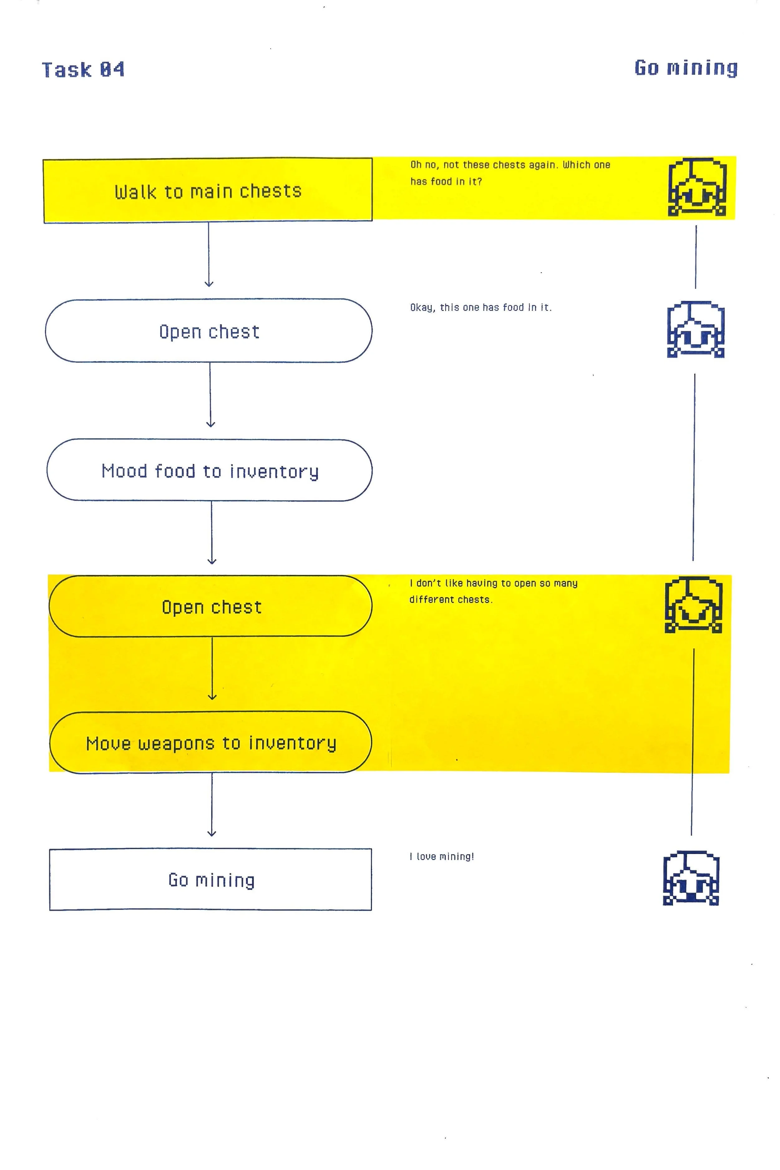
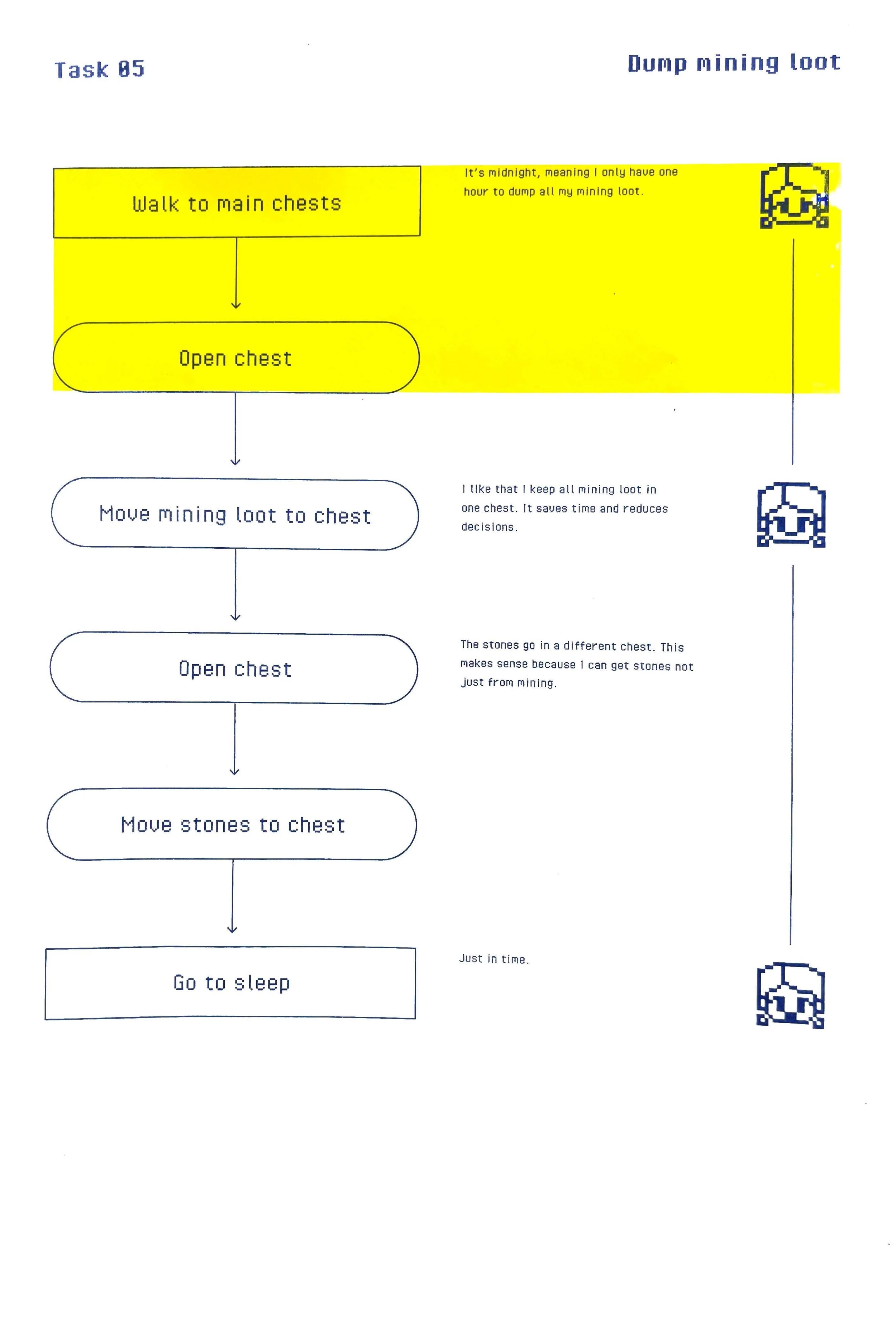
Task Analysis
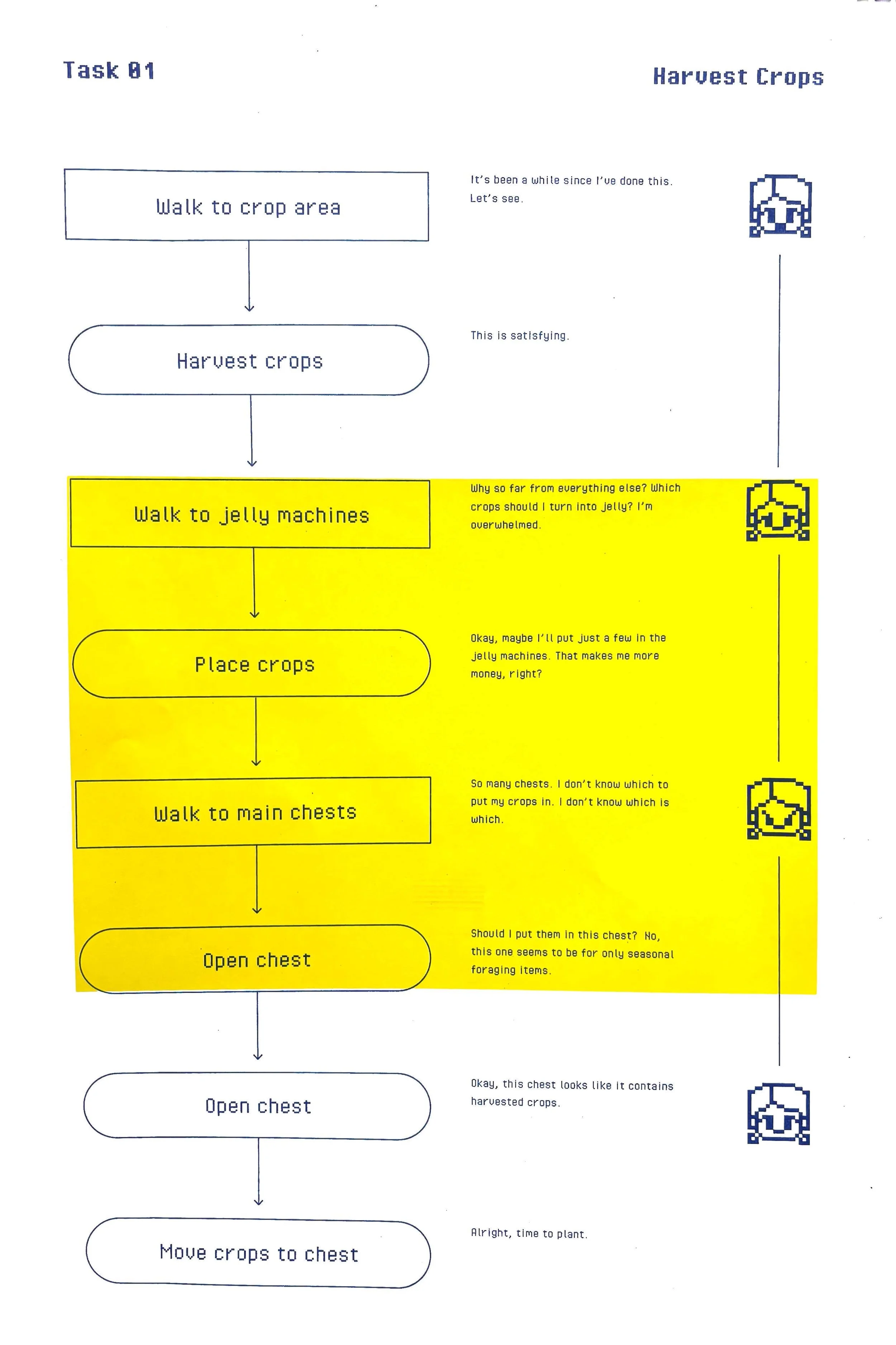
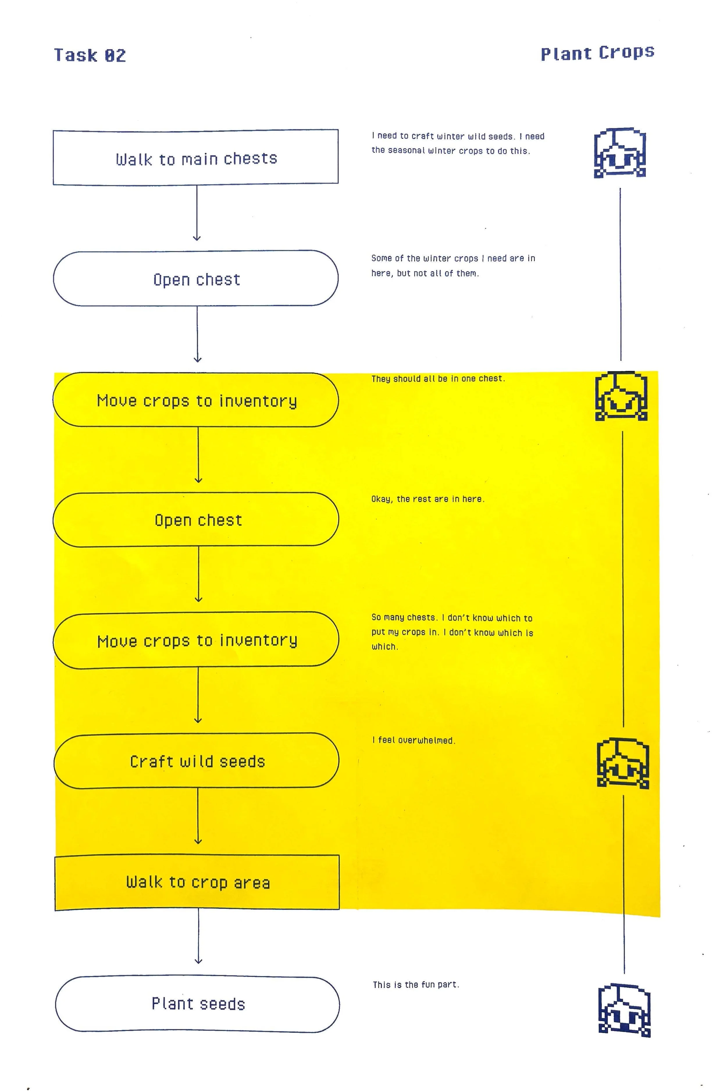
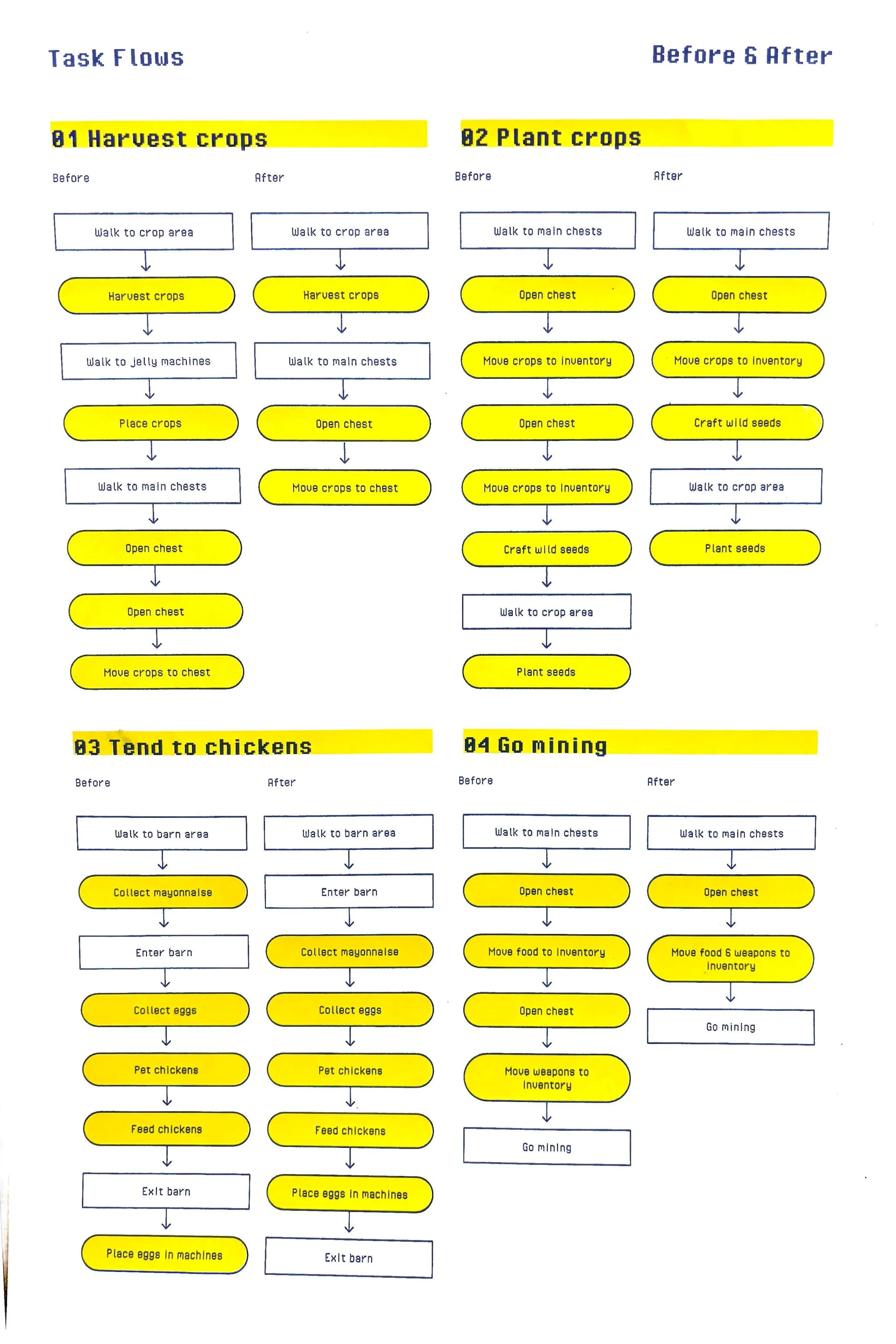
When redesigning a product, you must observe each individual task to understand what exactly are the pain points and points of decision making, to give insight onto what exactly should be redesigned.
I identified all the key tasks I do every in-game day:
Harvesting crops
Planting crops
Tending to chickens
Going mining
I then performed each task and took notes on each and every step I took along with any points of friction I noticed.
Redesign
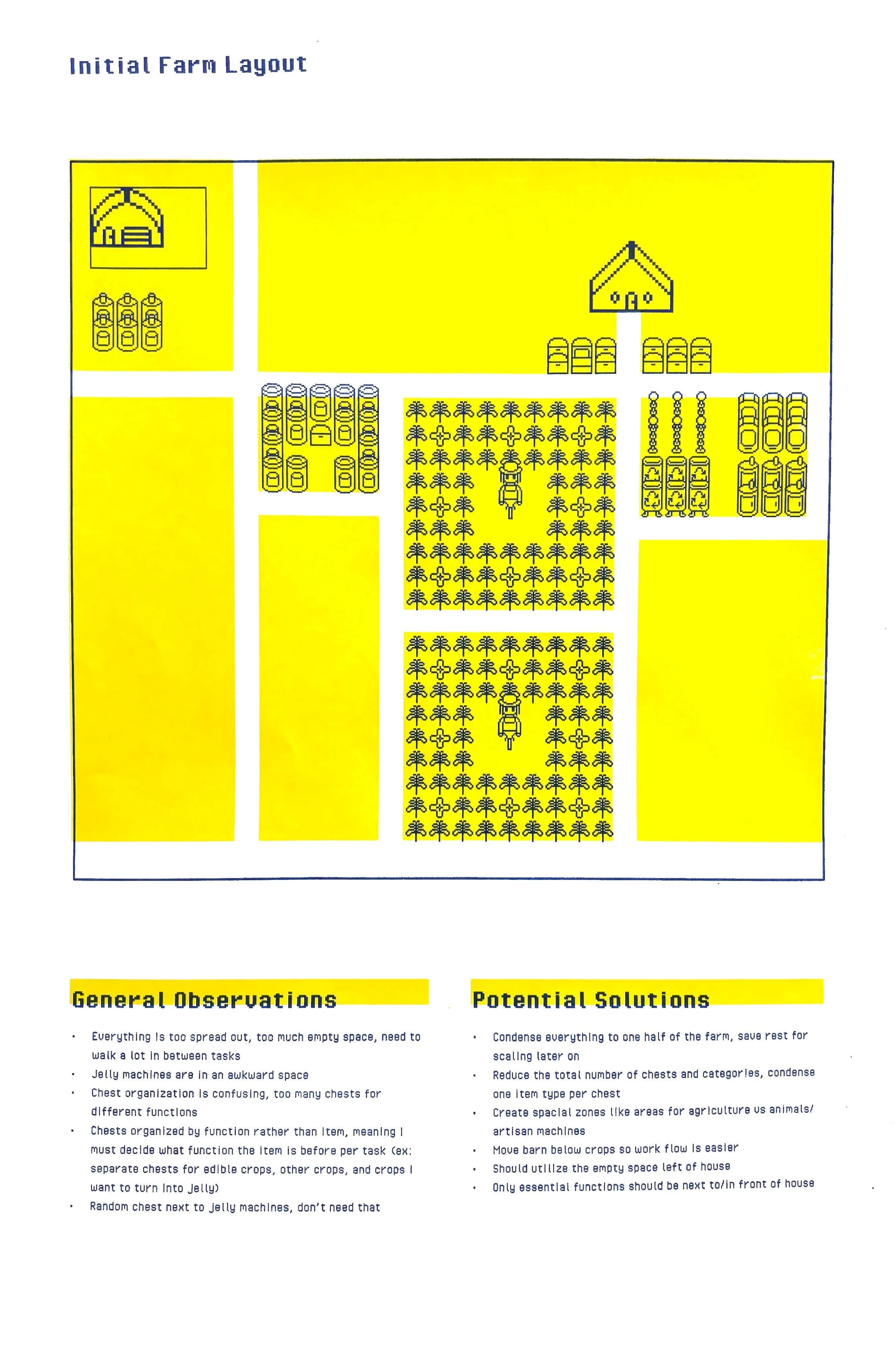
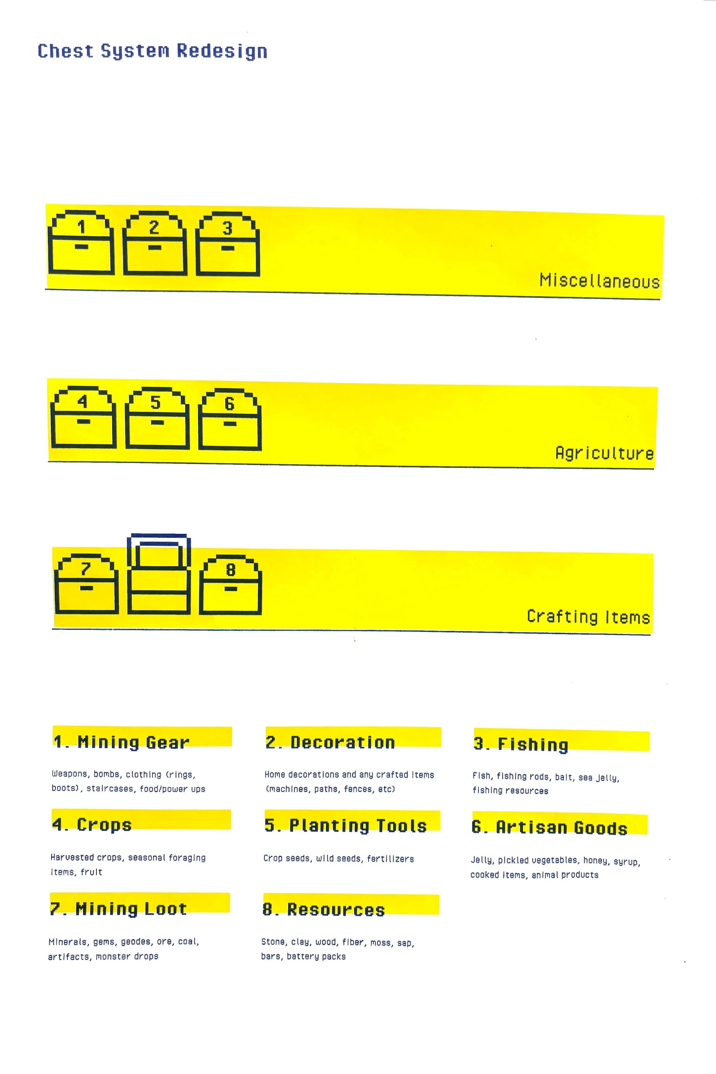
The main issue with my layout was my chest organization system. “Chests” in the game are a core part of the gameplay. Each daily task requires you to constantly open and move items back and forth between your inventory and your chests. There are lots of different types of items you collect in the game, like resources, weapons, crops, or animal products, which are all used to perform different tasks. It’s important to organize your chests so that it intuitively makes sense for whatever task you are completing, but my chests were not organized in a way that was intuitive for me. I needed to make lots of decisions for where to put my items, which caused friction.
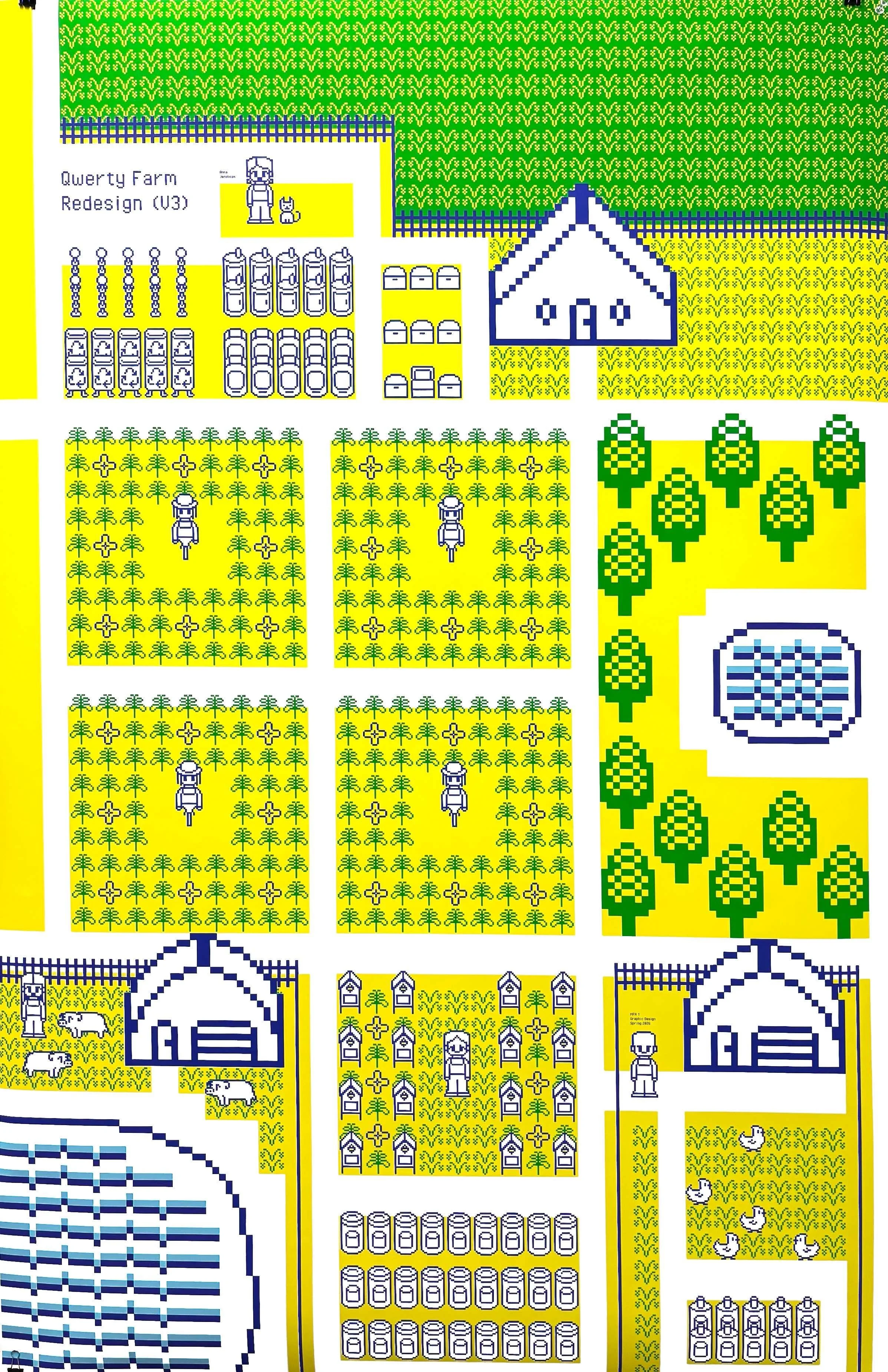
I noticed that with my initial setup, item types were split between chests, and there were too many categories. For example, I had a separate chest for foraged crops and farmed crops. This was unnecessary, because when performing a task where you need a crop, it does not matter whether a crop is foraged vs farmed. For my redesign, I organized the items so that they corresponded to certain tasks rather than specific item type; all of the crops belonged to a single chest, because tasks involving crops don’t differ depending on the crop type.
Apart from my chest organization system, I also reorganized the layout of my farm including the locations for my machines and barn. I moved everything to the right side of my farm so that my workflow would be easier and that I wouldn’t need to walk so much in between tasks. I also moved all of my chests and machines for crafting directly to the left of my house in a singular zone, because these items need to be easily accessible for all tasks.
Conclusion & Going Forward
Through this project, I experienced first-hand the importance of user-centered design. Ultimately, my new layout worked for me because it was designed based on how I actually played the game. Initially, I had assigned arbitrary categories for chests based on how I percieved they should have been organized based on the item type. However, the most efficient design doesn’t always correspond to concrete categories. Human behavior is not so predictable like that. We are messy, intuitive, and need designs that work with us rather than against us.
I also learned about the importance of reducing decision-making. People don’t like making too many decisions, and decision fatigue can reduce engagement. Just like I gave up on playing Stardew Valley last year because I was overwhelmed by my messy chest system, users may not use a product if it has too many features or is not intuitive enough to support their needs.
My farm was designed with just one user in mind: me. Now imagine this process, but for a product being used by millions of users with different needs. It’s almost impossible! The only way to get even close to designing a product that can work for the majority of users is through research and understanding.