Tufts Mobile App Redesign
A redesign project for the Tufts Mobile App.
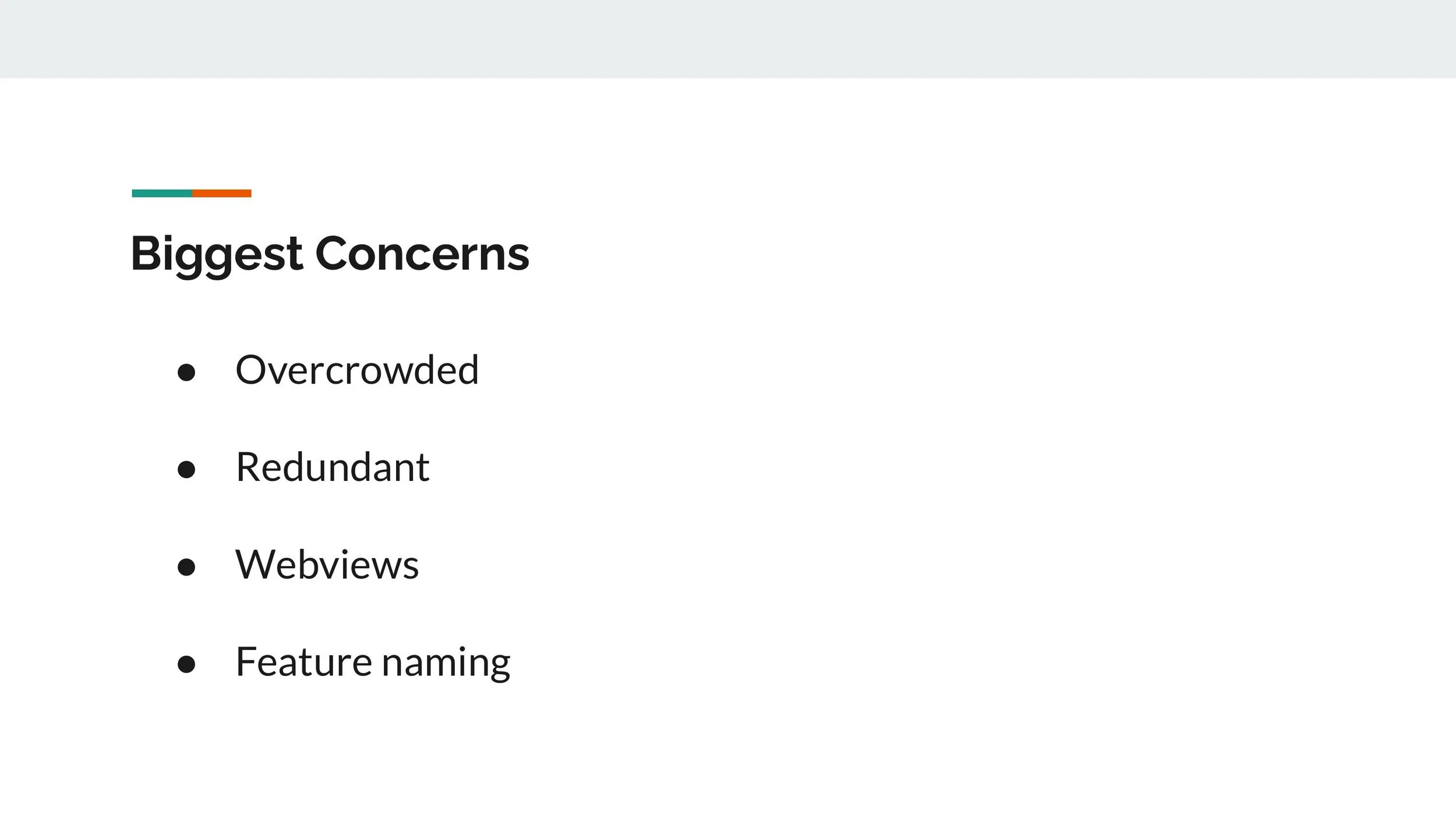
Project Objective
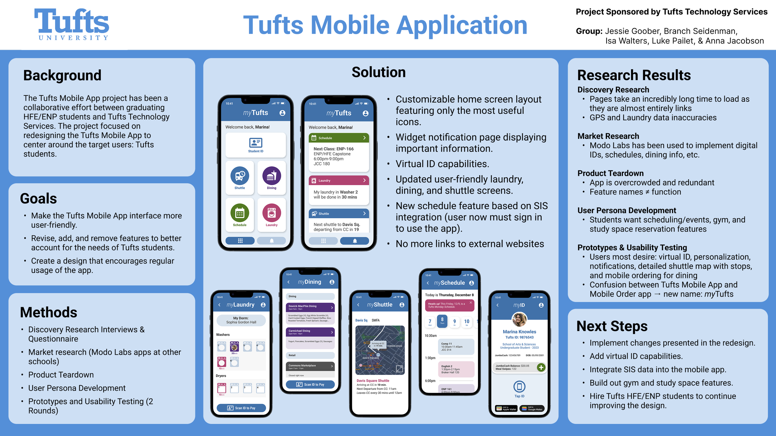
The primary goal for this project was to make the Tufts Mobile App more user-friendly and better account for the needs of Tufts students. To do this, we first completed discovery research to better understand the experiences and pain points of students. Then we were able to identify the three aspects of the application that needed to be researched. A secondary goal was to gain feedback on the users preferences for features, layout, and overall application experience. Once we understood their perspectives we were able to develop an initial prototype to cater to the initial research we found. A goal for the prototype was to create a sleek, easy to use, and visually appealing UI.
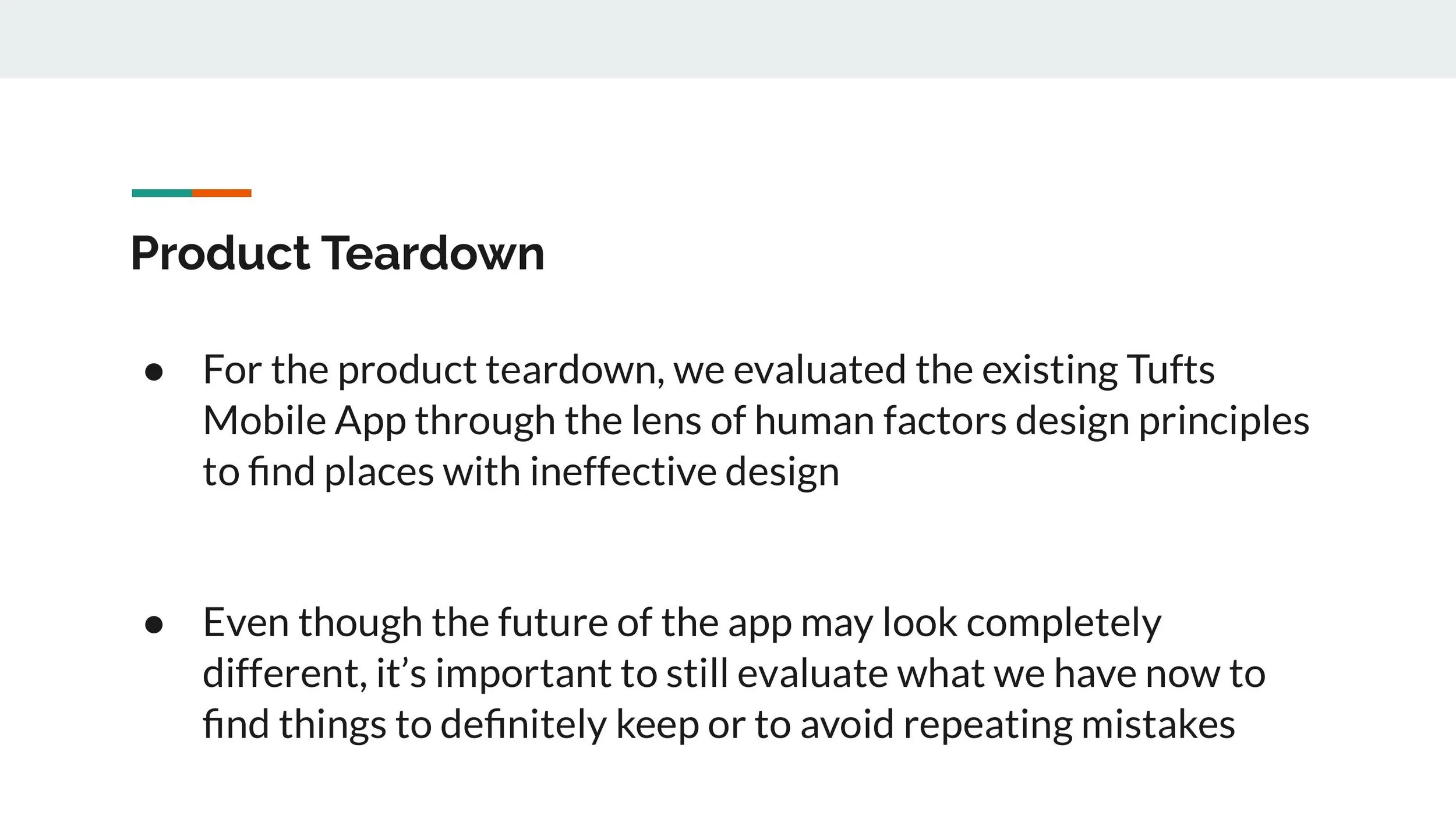
Product Teardown
Questionnaire
We distributed a Qualtrics questionnaire through various channels, including Facebook groups and personal social media accounts, and also enlisted the help of professors to distribute the questionnaire to their students. We received a total of 46 responses from undergraduate and graduate students from different class years and schools within Tufts, providing us with a comprehensive sample of the Tufts population that could use the app.
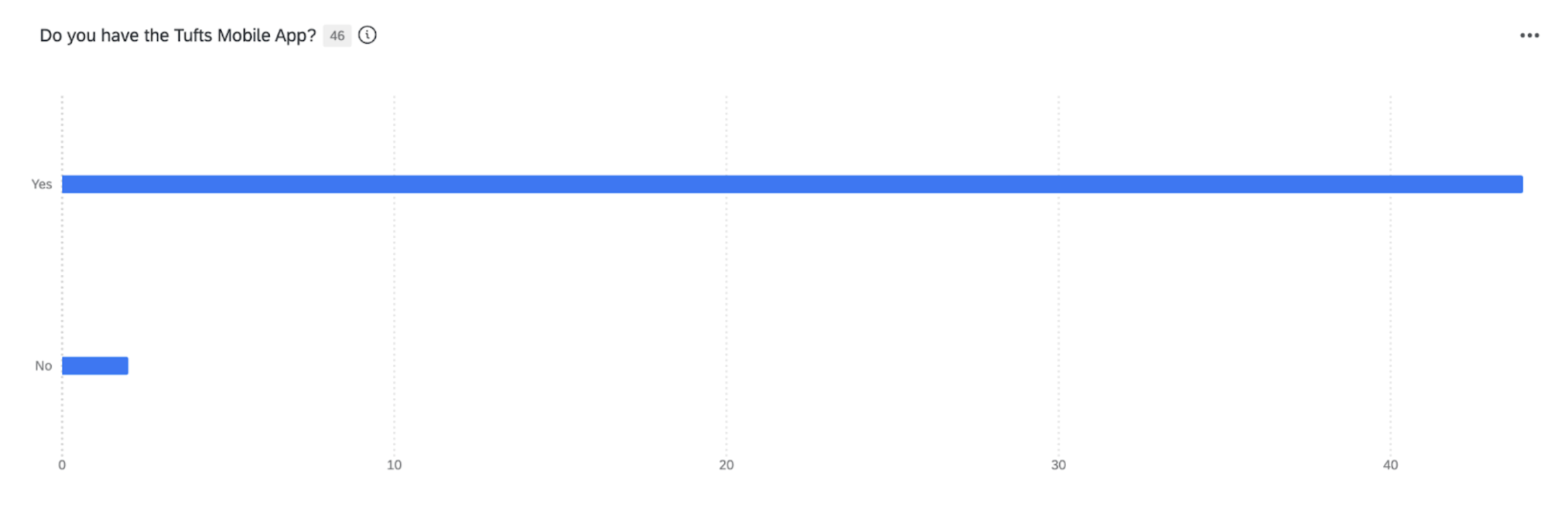
Question 1: Do you have the tufts mobile app?
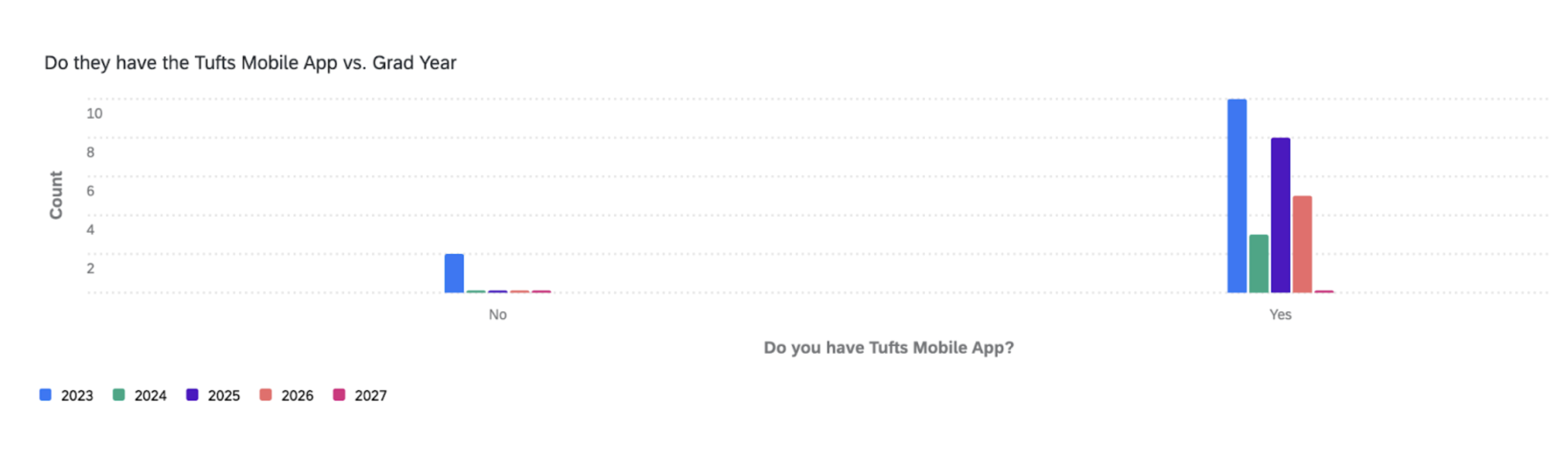
Question 1 Results: By graduation year
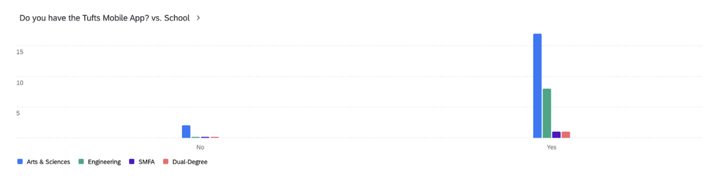
Question 1 Results: By school
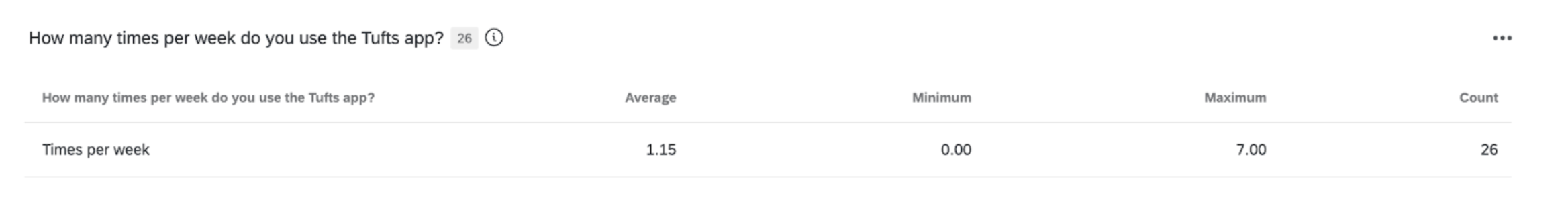
Question 2: How many times per week do you use the Tufts app?
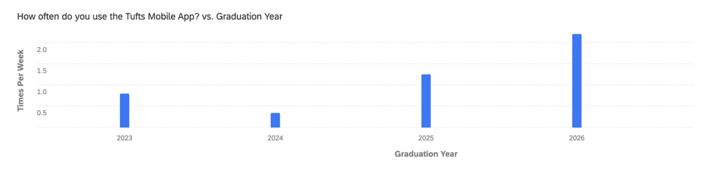
Question 2 Results: By graduation year
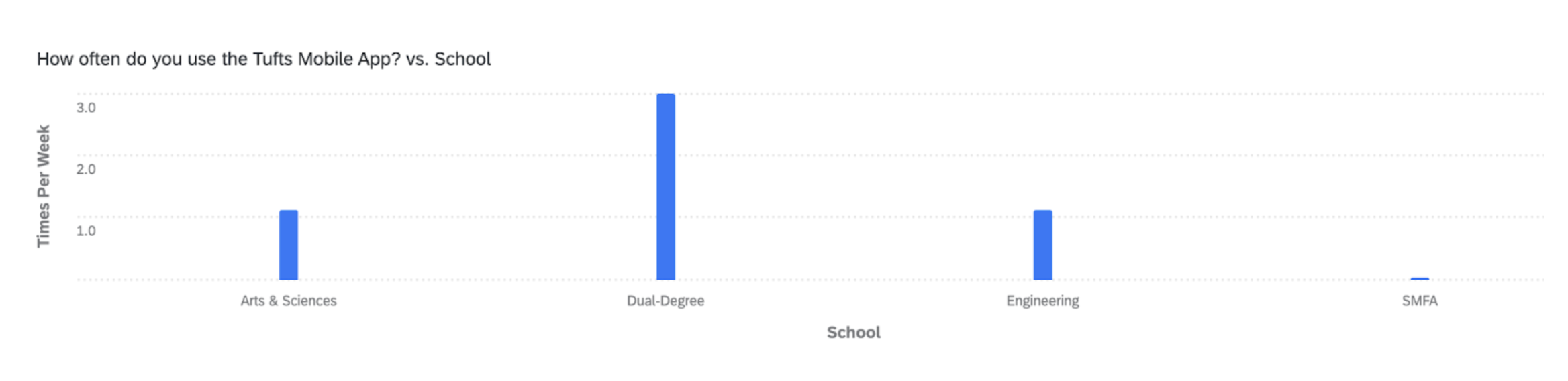
Question 2 Results: By school
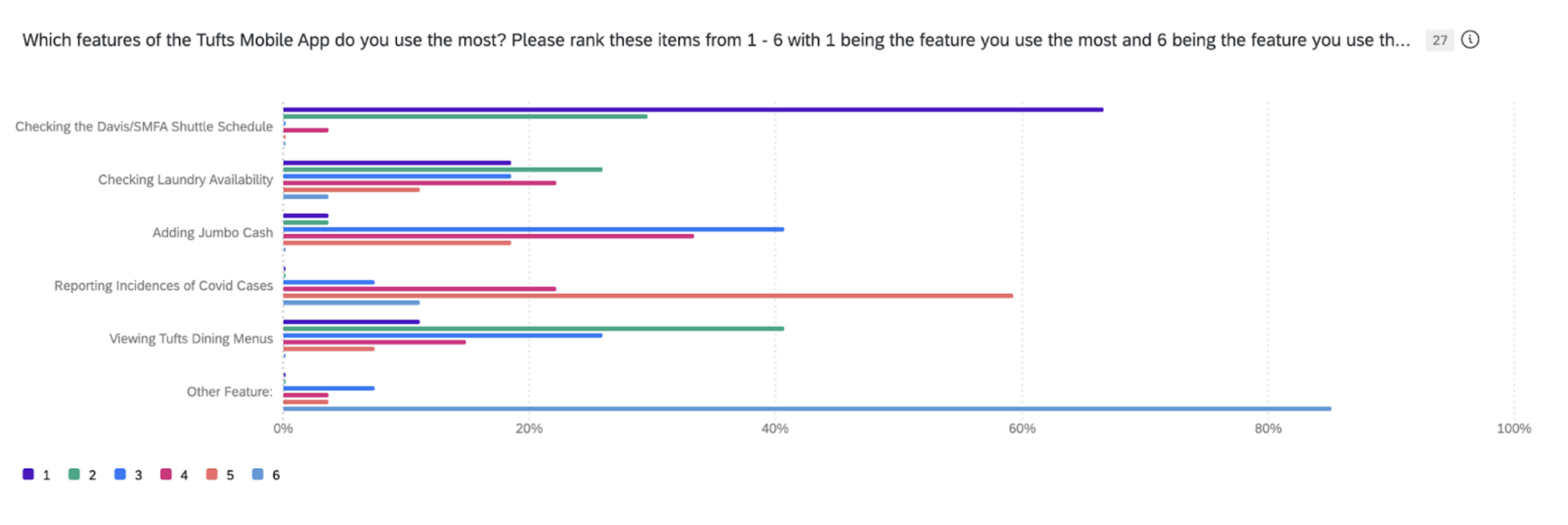
Question 3: Which features of the Tufts Mobile App do you use the most?
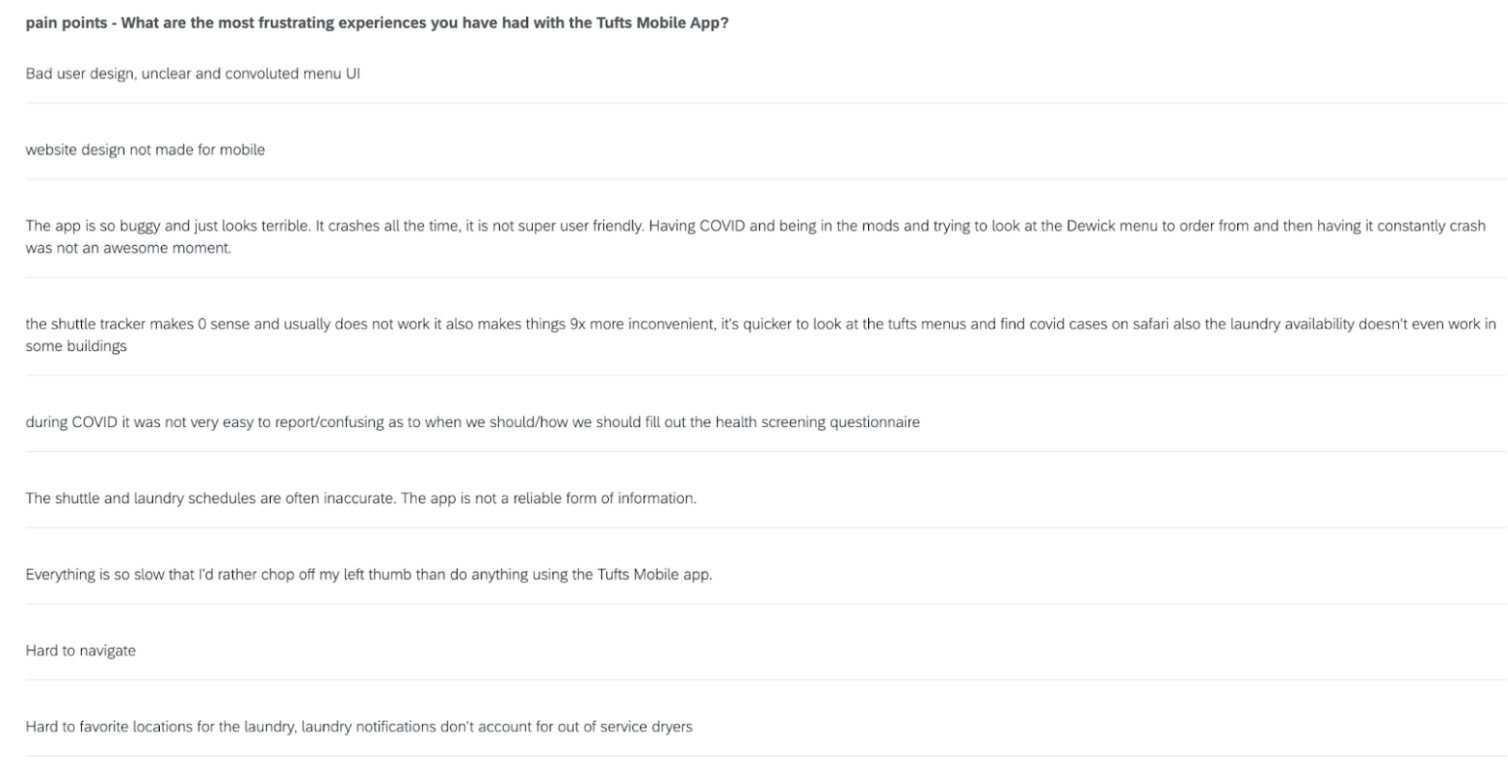
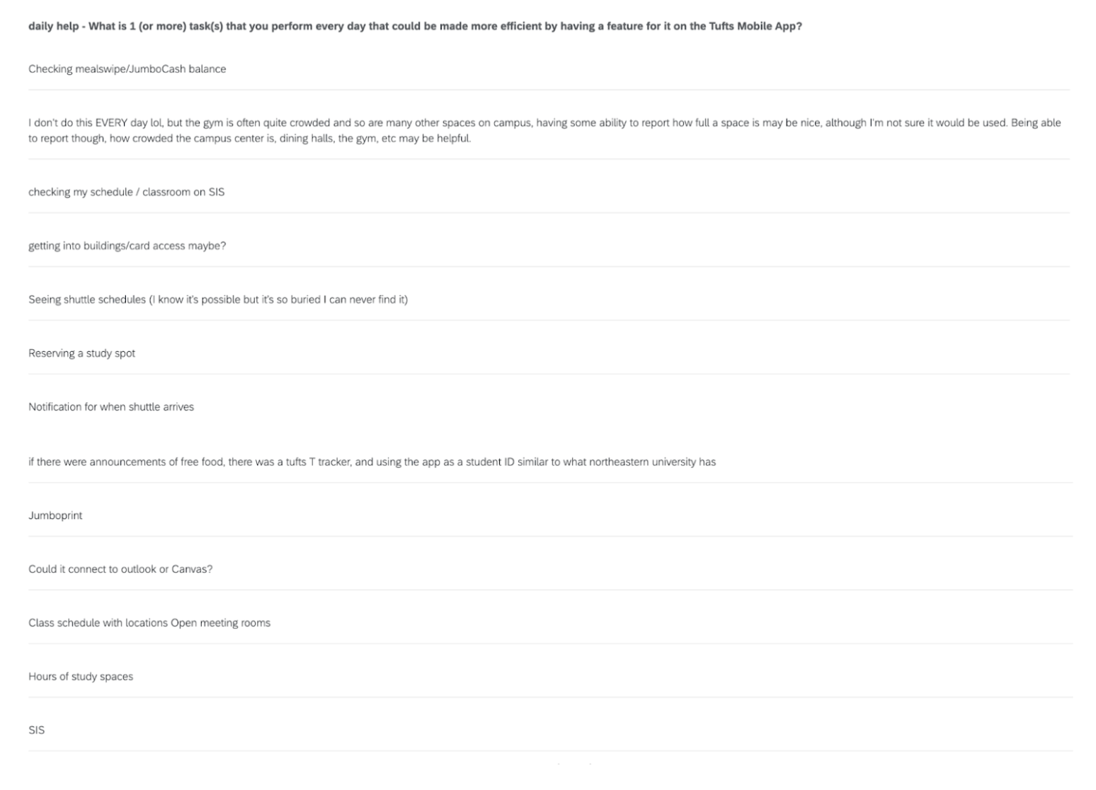
Question 4: Pain Points
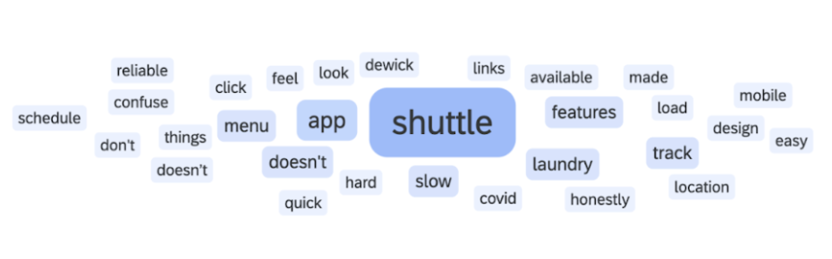
Question 4: Pain points word cloud
Question 5: Improvements
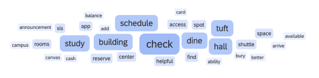
Question 5: Improvements word cloud
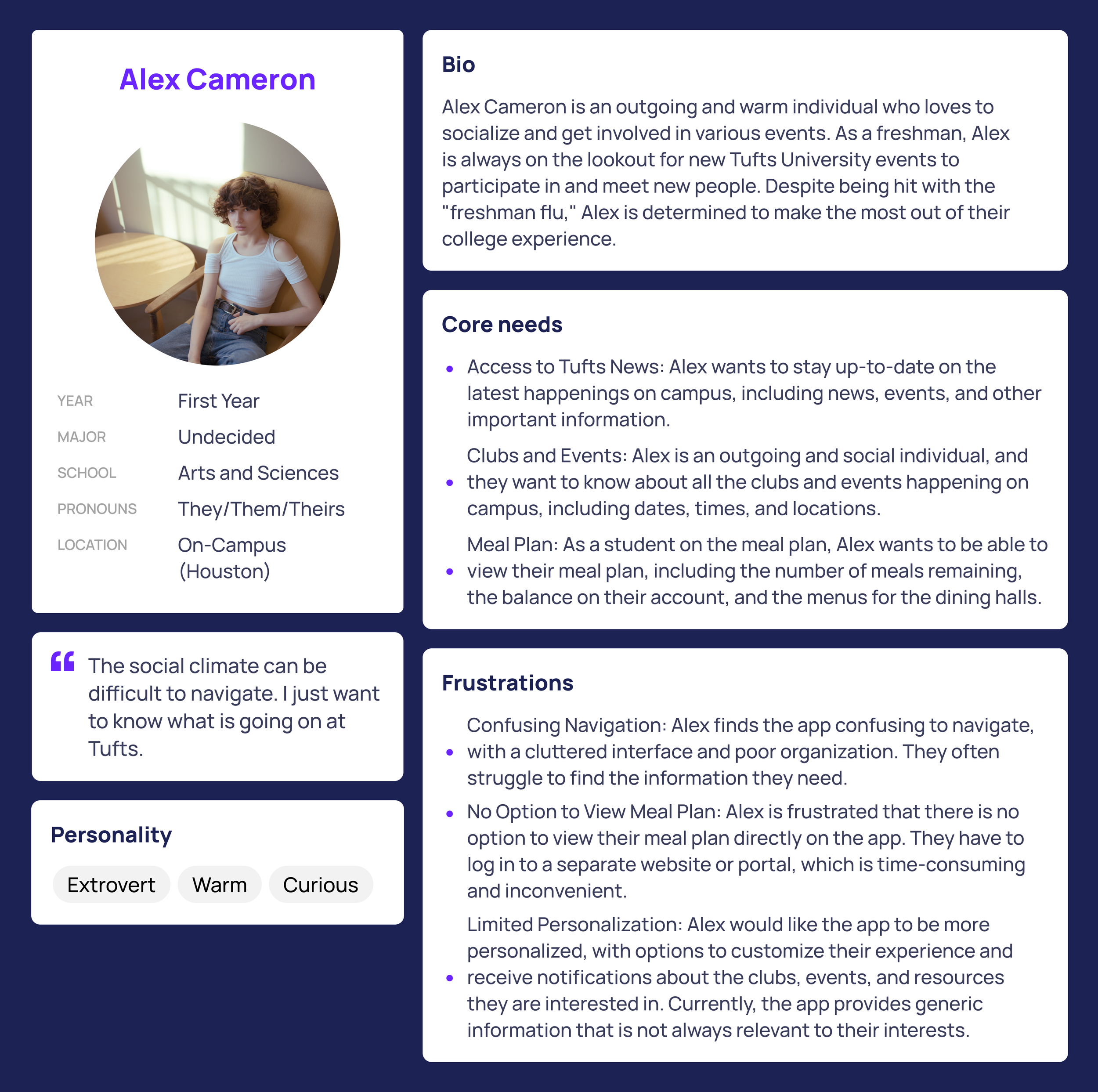
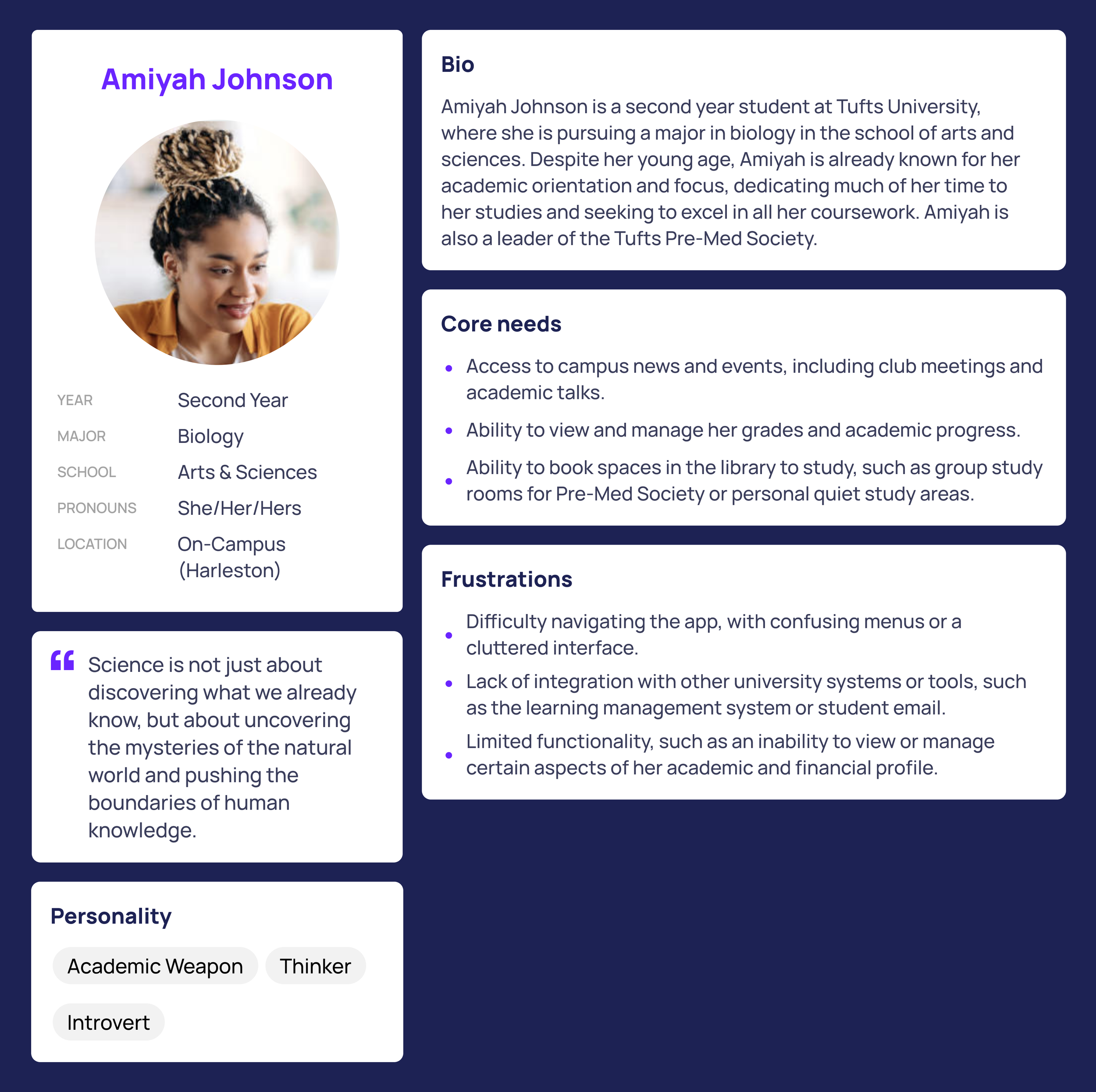
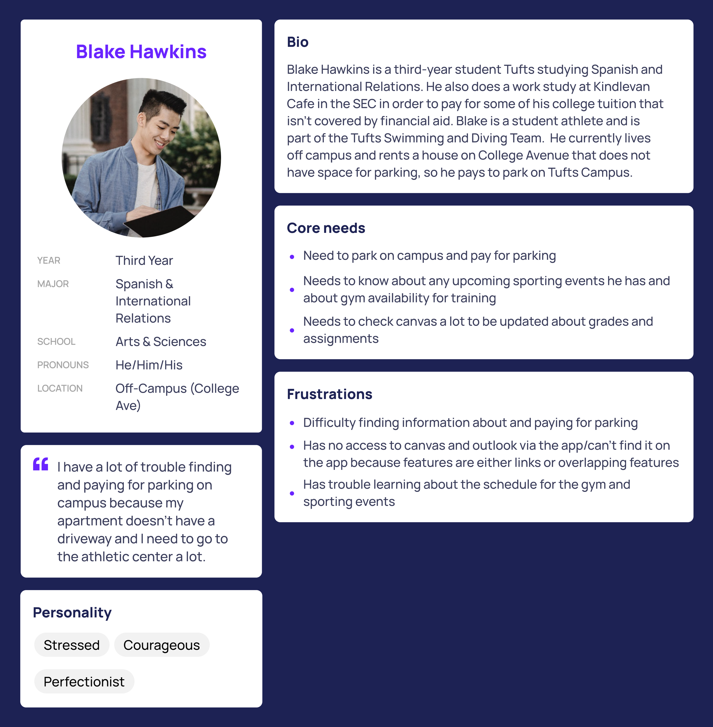
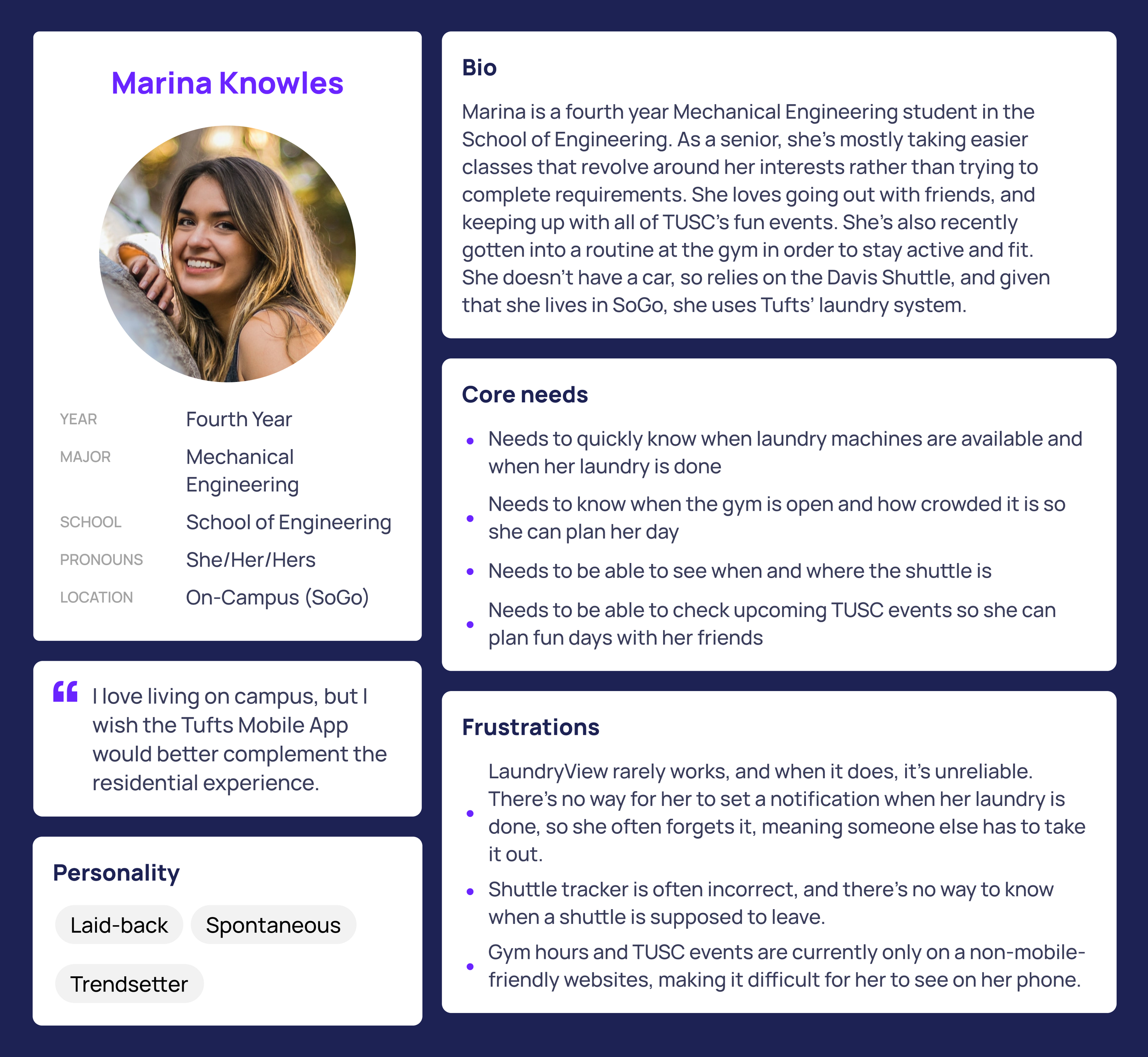
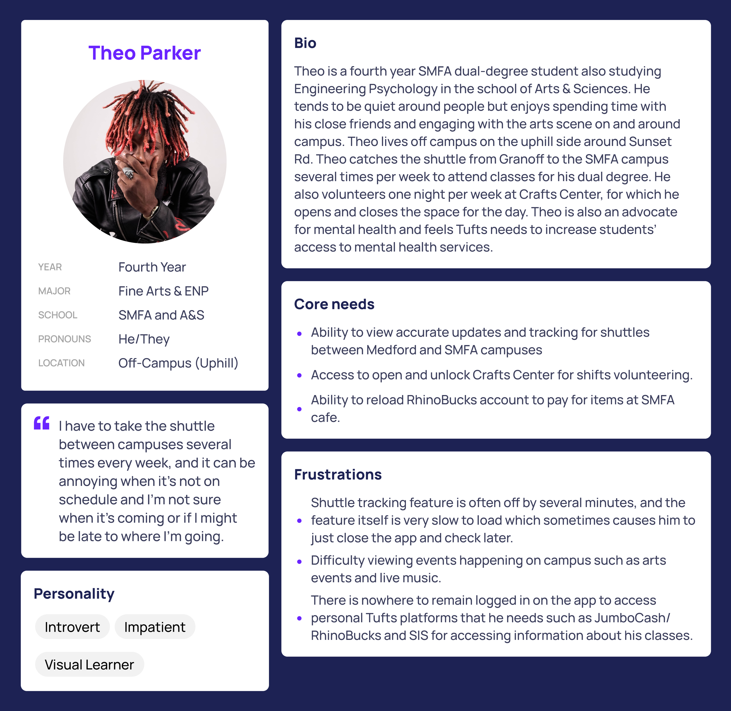
User Personas
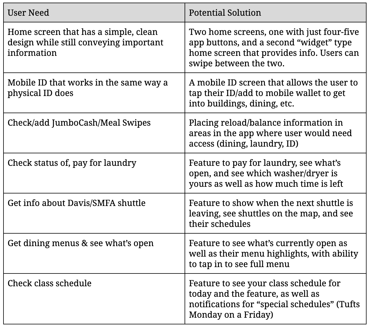
User Needs & Requirements
Wireframes
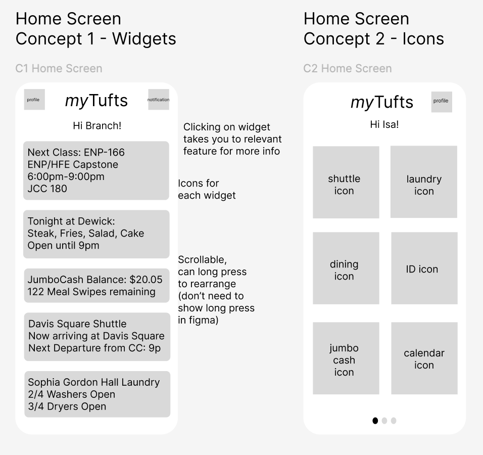
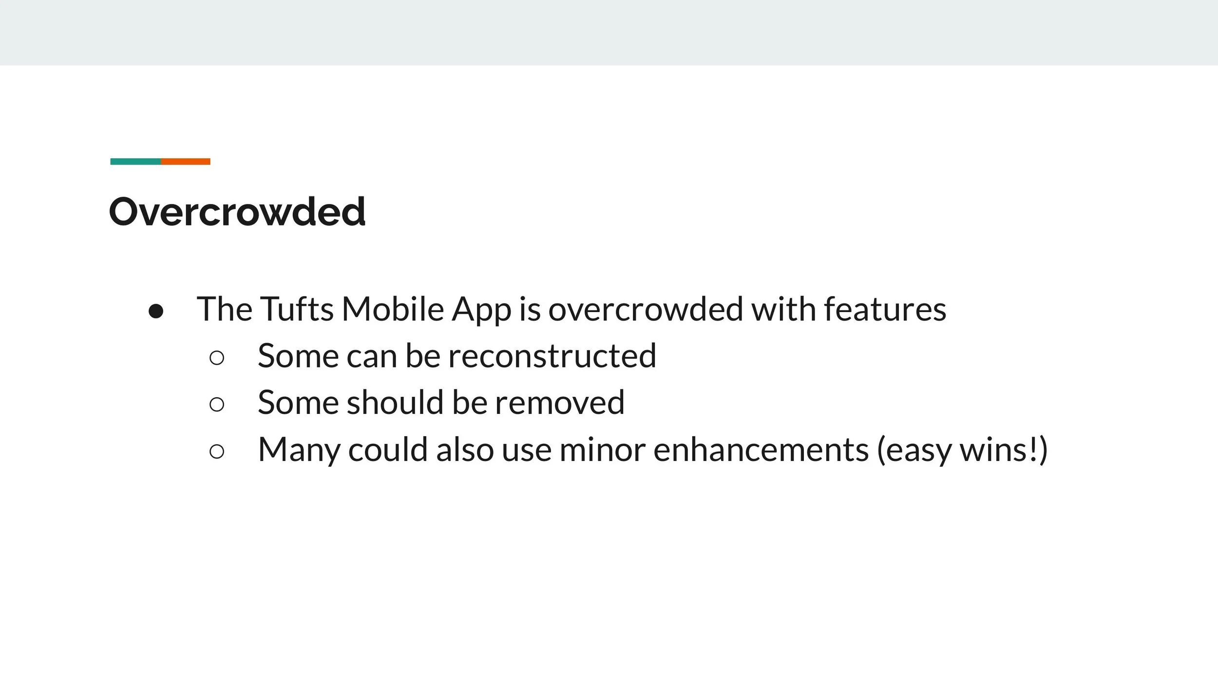
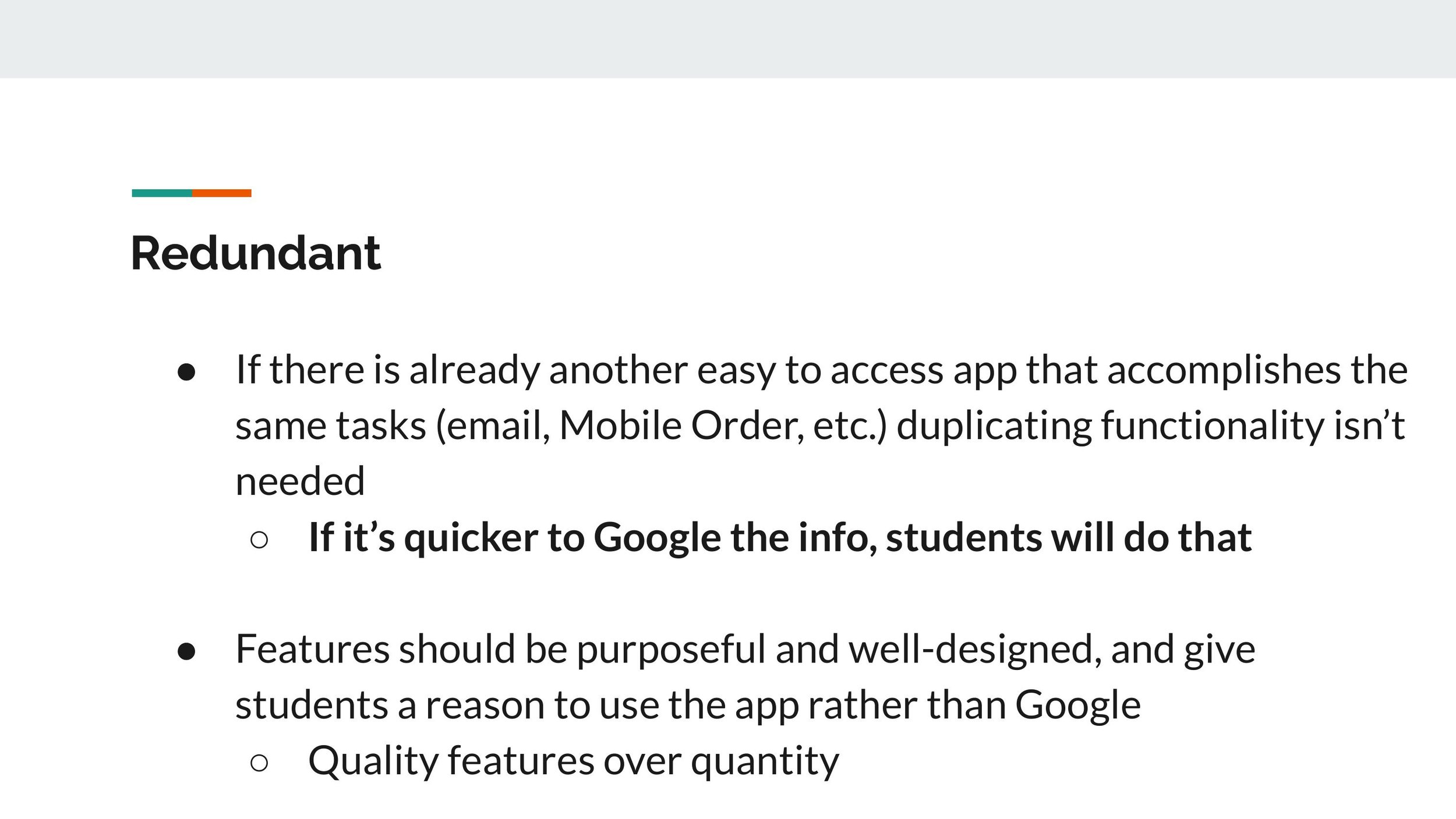
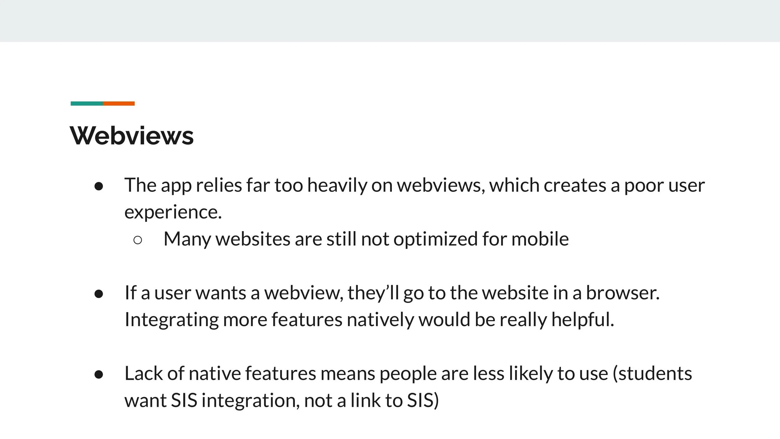
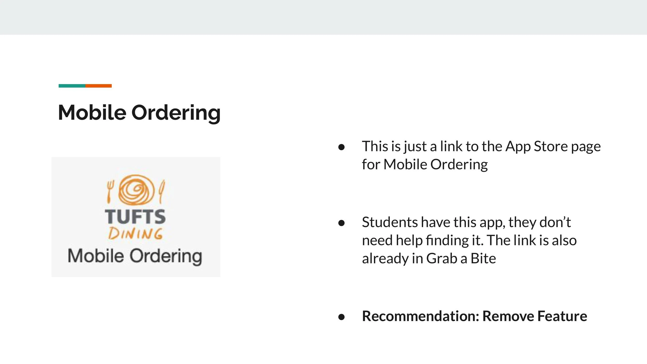
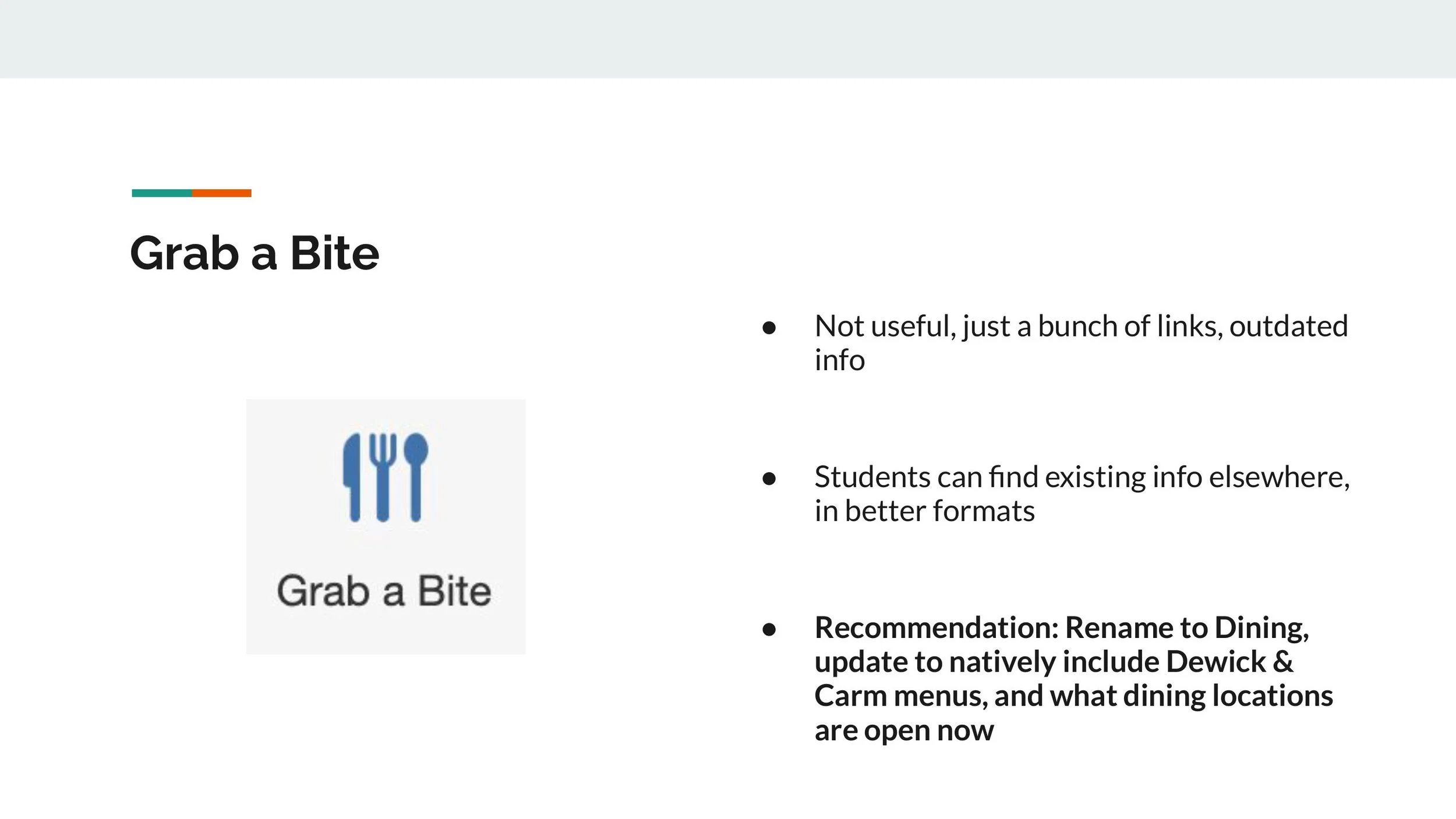
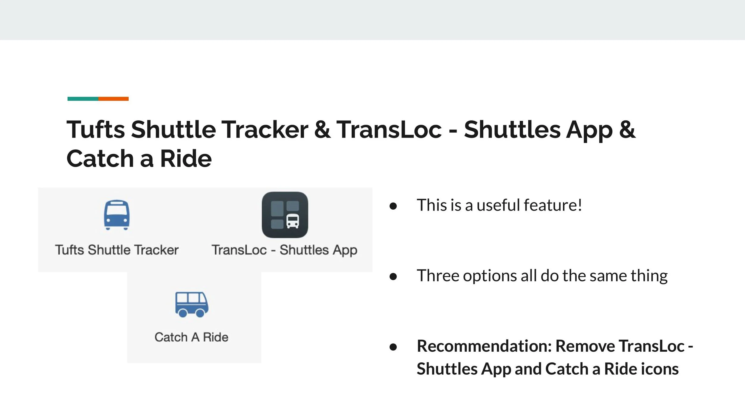
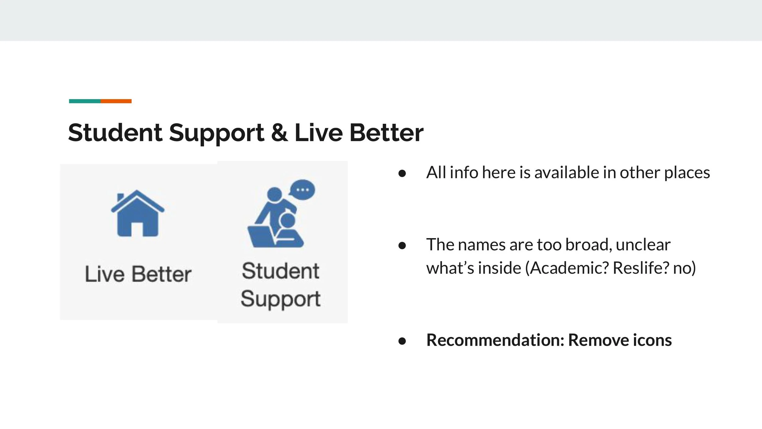
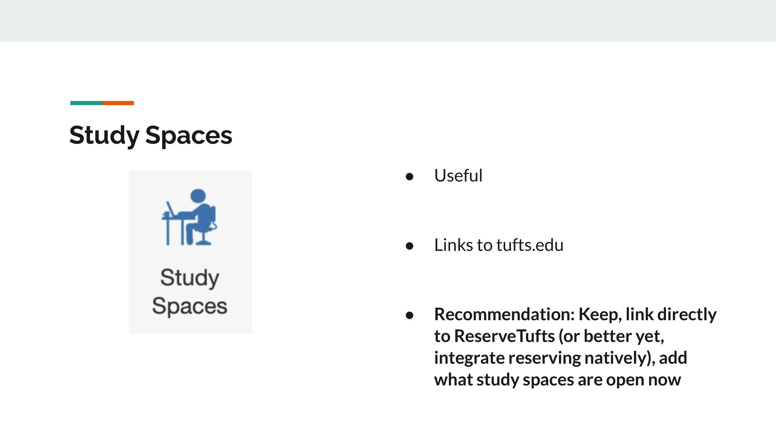
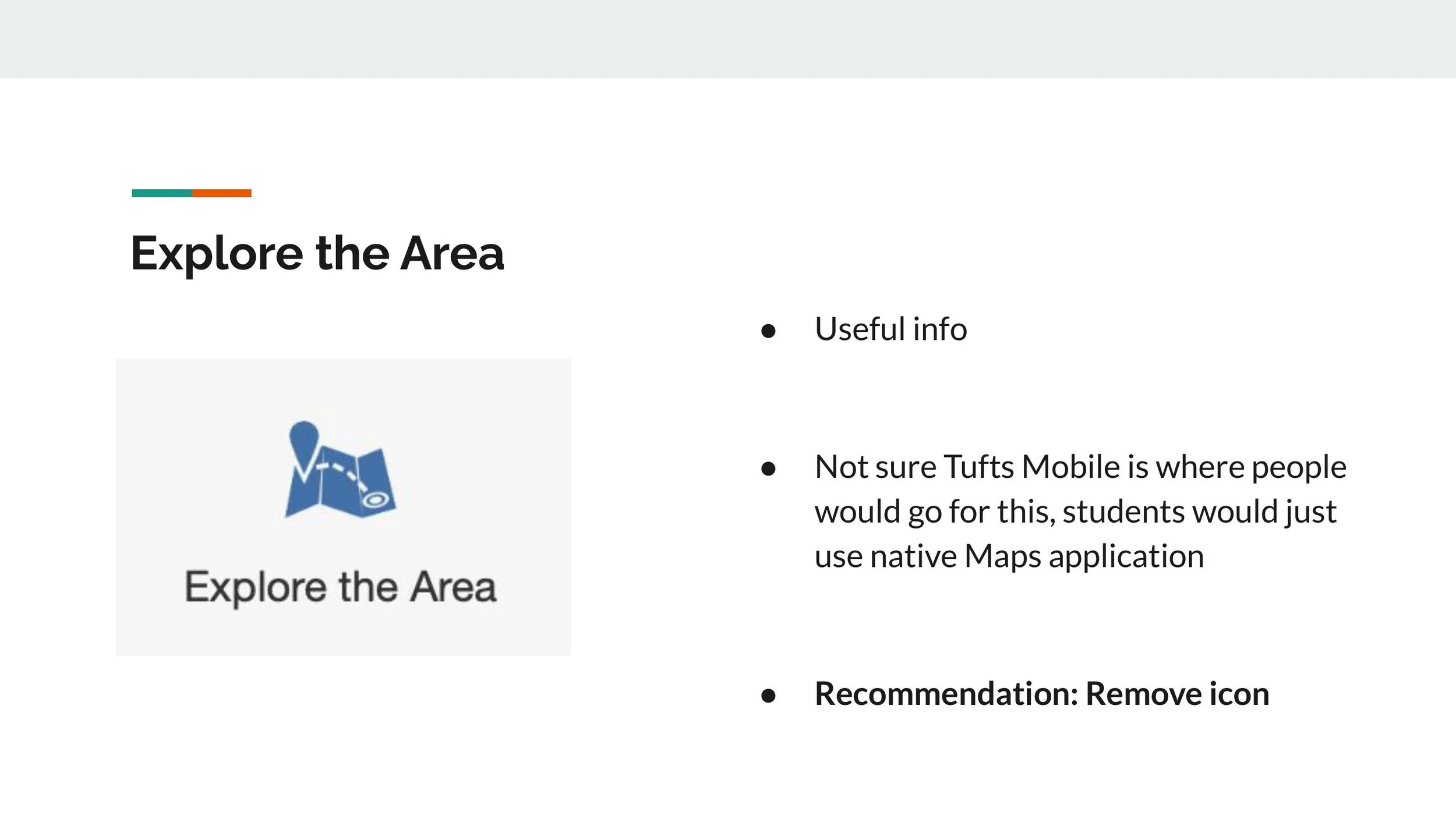
After gathering feedback from users of the current Tufts Mobile App, it became clear that there were several issues that needed to be addressed in the redesign. Specifically, users felt overwhelmed by the amount of information presented on the home page and frustrated by the fact that certain buttons redirected them to external websites instead of being built into the app.
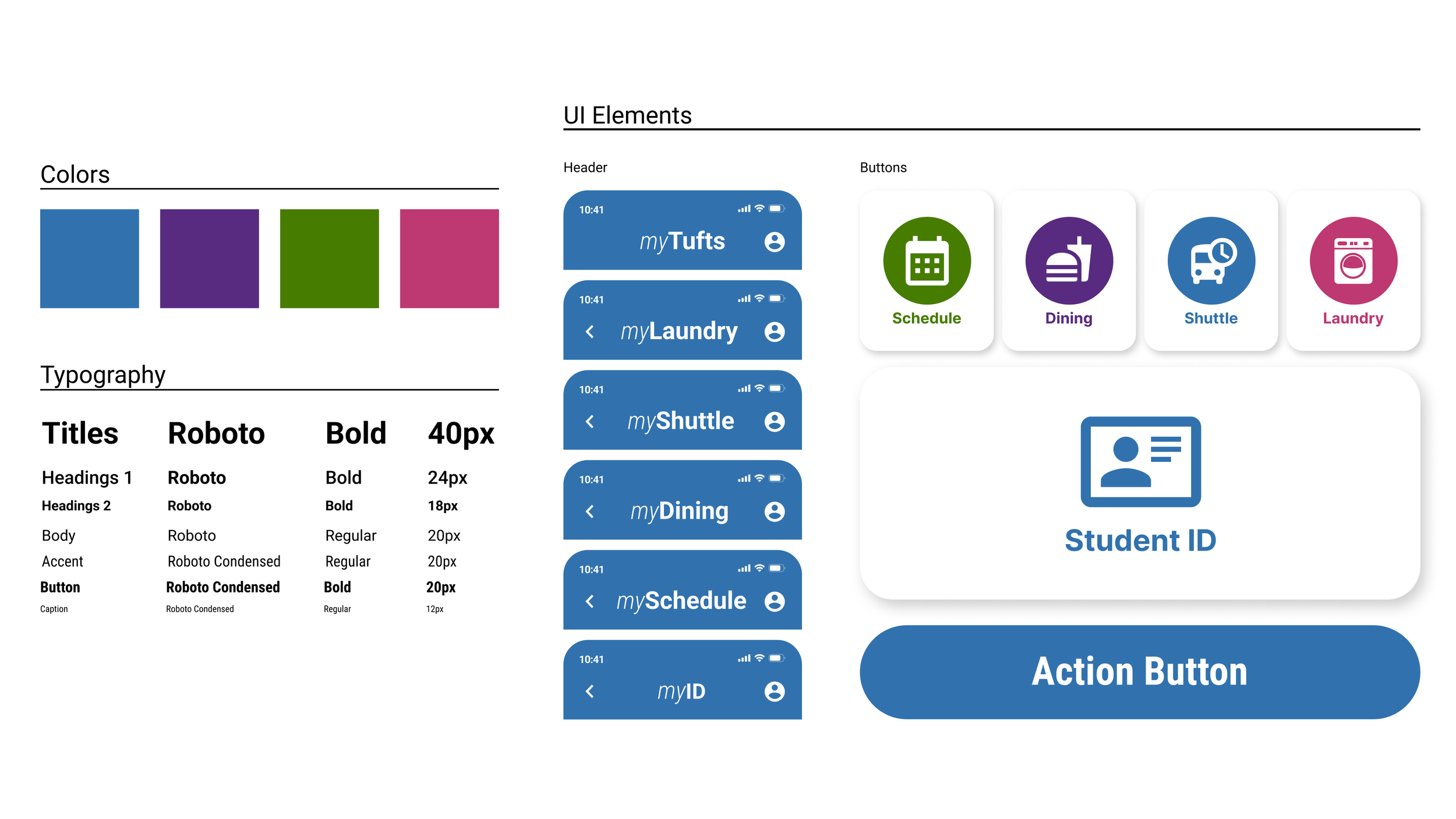
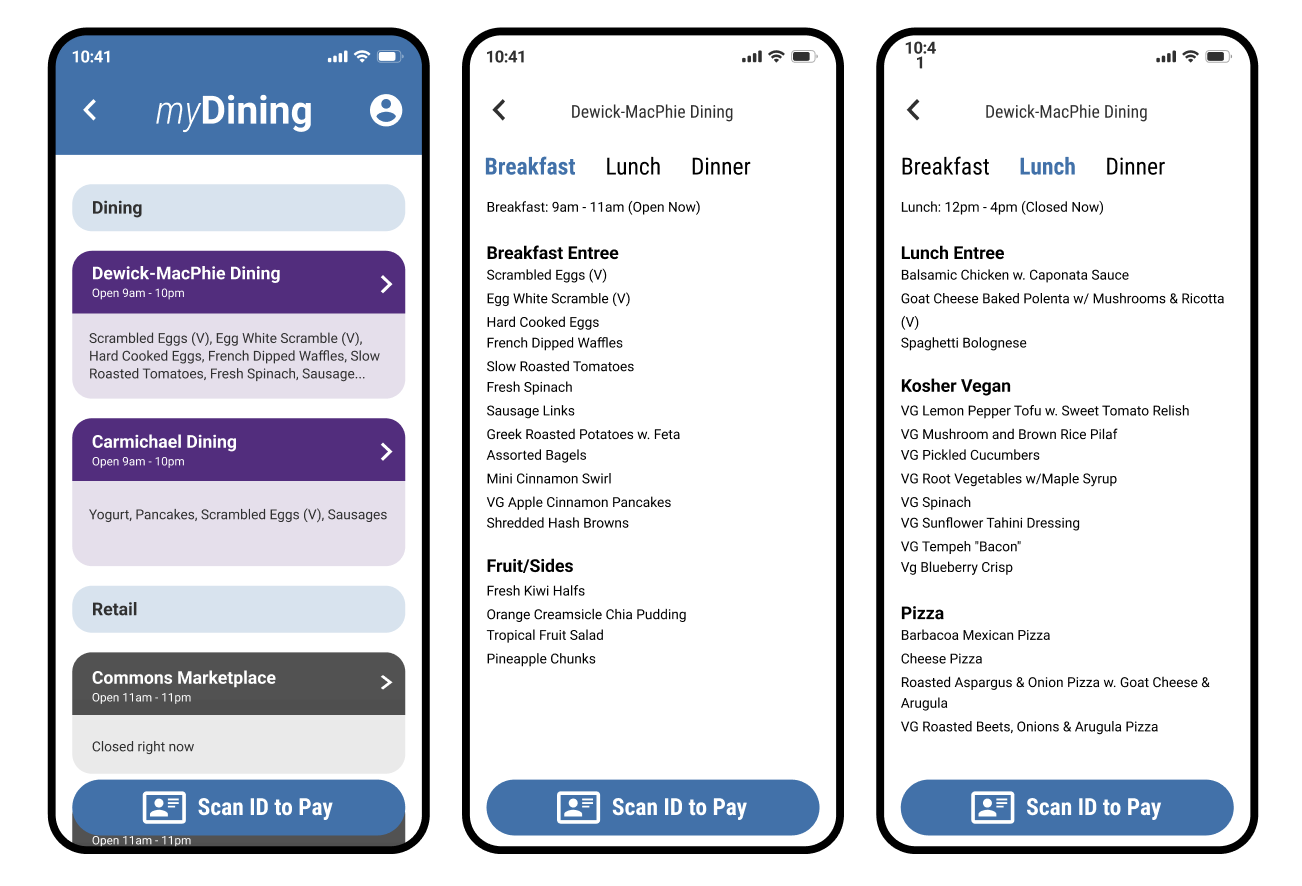
To address these concerns, our design team proposed a simple and minimalistic approach for the new Tufts Mobile App. The focus would be on presenting only the most essential features and information that students are most likely to need on a regular basis.
Hi-Fi Designs: First Iterations
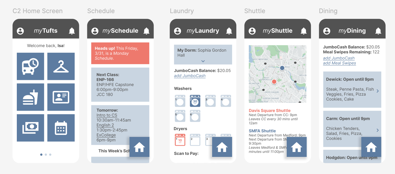
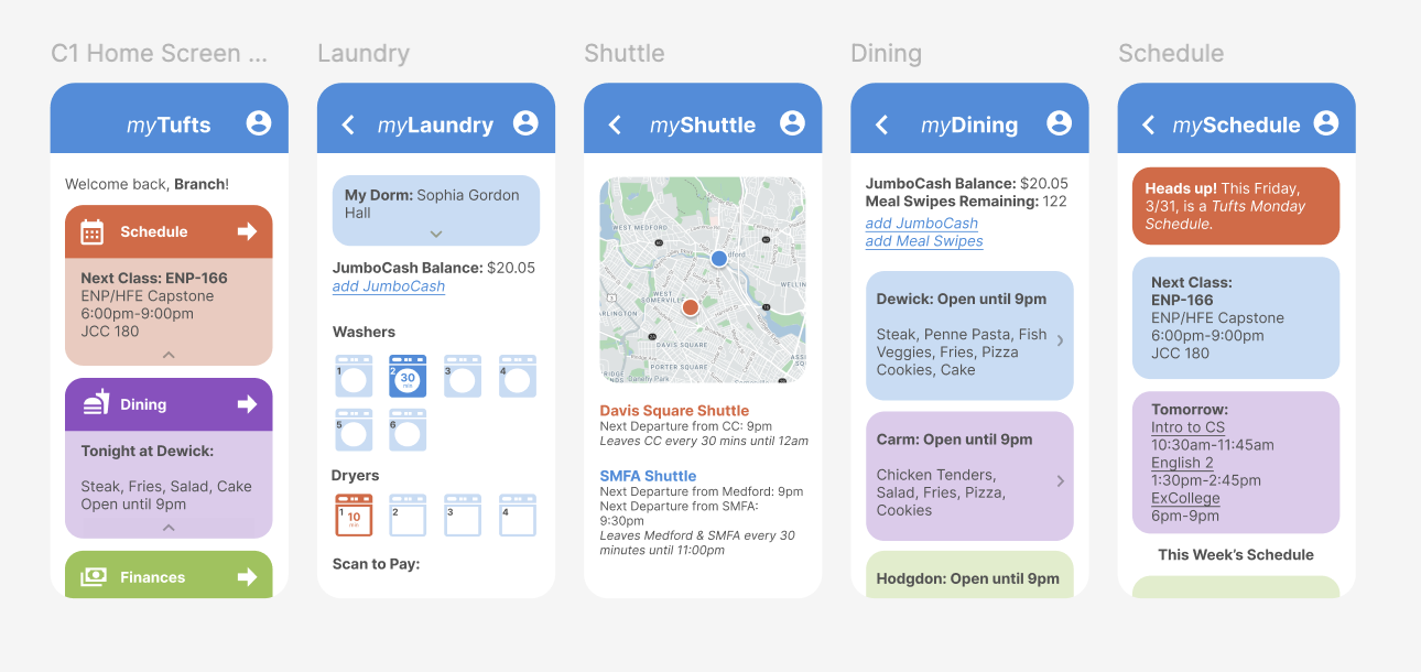
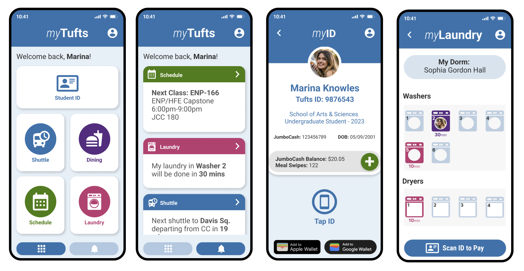
After the initial round of user feedback on our proposed redesign for the Tufts Mobile App, we received a lot of valuable insights that have helped us to refine and improve our design concepts. Overall, users were very positive about the general app design and found it much more useful than the current app. They appreciated the ability to see information right on the home screen and customize their widgets to fit their personal preferences.
One of the biggest hits among users was the idea of a Mobile ID feature, which was universally loved by all participants. However, we also learned that there wasn't much need for a finance widget, as it was easily confused with being about financial aid or payroll rather than about adding JumboCash. Additionally, some users didn't particularly like the color palette, finding it too bright and "childish," so we will be reevaluating our color choices and making adjustments to better meet accessibility guidelines.
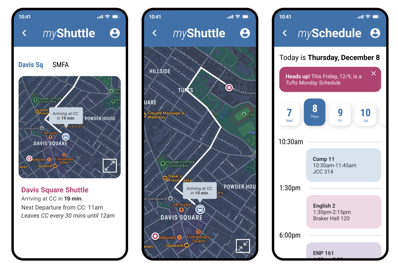
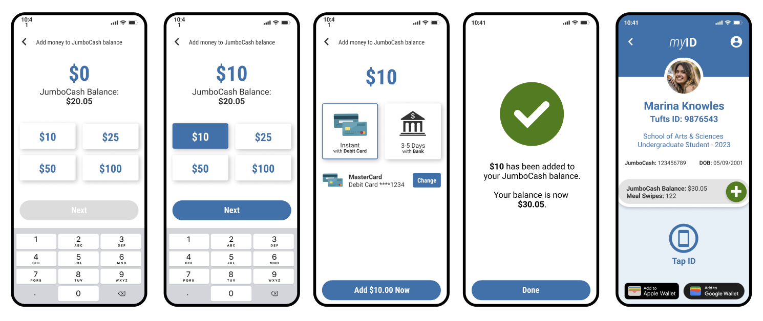
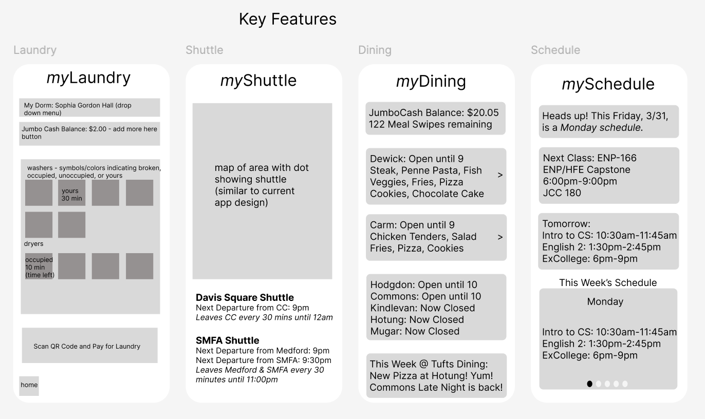
Based on user feedback, we have learned that people expect the app to be personalized based on their student attributes and provide accurate and reliable information. Additionally, we will be building out the show ID and refill JumboCash flows, as well as adding a calendar view for events. Users also expressed a desire for timely, relevant, personalized notifications, such as alerts when laundry is done or shuttle buses are leaving.
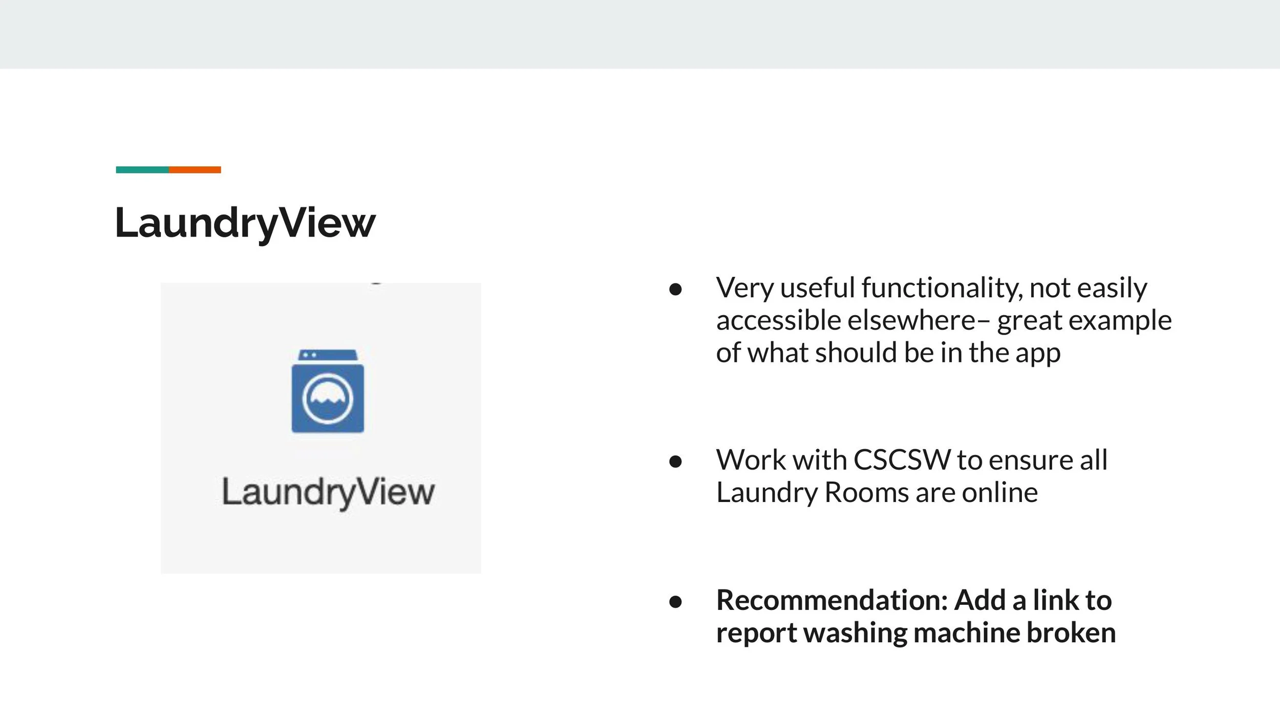
Other areas for improvement include fixing the laundry page to make it more clear which laundry machines belong to the user and how much time is left, and building out the shuttle page further to show a more detailed map and make it clearer where the stops are vs. where the shuttle buses currently are.
Final Design Concept